Good Example Of Typography
A good example of Typography used in an editorial format for me would certainly come from Taylor Swift’s primary website. For reference I’ve included several images demonstrating how the format has changed drastically over just four years.
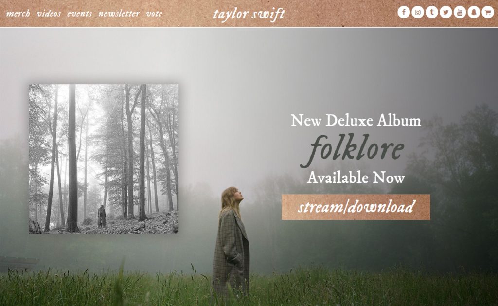
Looking back at 2020 in the ‘folklore era’. The primary font used is ‘I’m Fell DW Pica’, with the original typography stemming from the 17th century by John Fell, who was heavenly inspired by the Romans (fonts.google, 2024). Moving forward, it’s interesting how this extremely rough font has been given an almost romantic redesign. Using a soft colour pallet of greys and whites overlaid on an almost rose gold, increasing the letter spacing, on top of adding a slight italic to the text… has all contributing to changing a ‘scratchy’ font style into a very delicate title
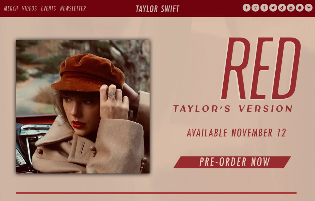
Moving on to 2021… Taylor has boycotted John Fell and moved on to Ryoichi Tsunekawa, only with a twist. After a year of serifs and lowercase lettering, we’re now on to FULL CAPITALS, highlighted using a heavily edited version of Bebas Neue (fonts.google, 2024). She’s taken the original font and curved the counters in the letter R and D, completely removing the previous harshness of the font and instead giving us a much more retro appearance. This is very interesting when you take into account the colour choice as well. Using a pallet of reds (even in the background), a normally considered ‘harsh’ colour, she has instead demonstrated how using different fonts and colour can encourage us to perceive a certain period of time.
Holding these website designs side by side, you wouldn’t believe they’re by the same creator with such a bold contrast between the two. It’s incredible to see how just through the use of different typography and colour pallets Taylor Swift has managed to completely redesign her aesthetic. Even now she continues to use new typography to instill an array of emotions throughout her music and adds a high design standard to all her products that I think we should all be inspired by.
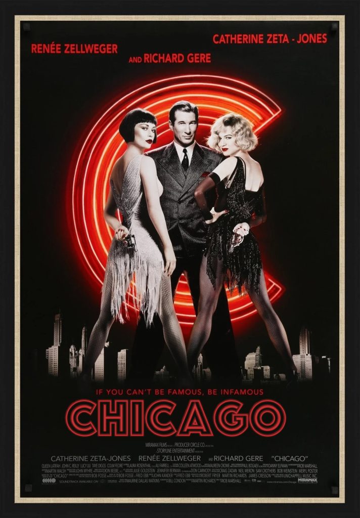
Bad Example Of Typography
For my bad example of typography, I’ve leaned more into my chosen category, looking at the movie (adapted) poster for the film CHICAGO.

So why is this bad, well the font in use is ‘Futura’, a geometric sans-serif typeface from 1927. The font was popularized primarily through the IKEA logo (wikipedia.org, 2024), to show you the preconceived bias we may have. To look at the poster, the typography is incredibly lacking. At a first glance, your eye is naturally drawn to the imagery, and it takes an embarrassingly long time to acknowledge the title. With such a well thought out image choice, using a grey-scale, highlighted with only a fraction of colour via the lighting… it seems the opposite approach has been given to the title. With the primary colour of the text being black, with only a red drop shadow. The whole thing feels very dark, especially once you realize it’s already on a black background, rendering it nearly invisible.
Let’s look at how I fixed it. My first task was finding a new typeface, so I researched 1920s fonts (ensuring they were historically correct). I settled on the 1923 German font ‘Phosphor’ by Jakob Erbar (fontsinuse, 2010). I chose this bold, sans-serif font primarily for the stylized ‘showbiz’ effect. I knew that the inner outline would work well with the ‘neon’ style I wanted to achieve.

Loading the original poster into Adobe Illustrator, I removed the title and started creating my own. I’m not very skilled with Illustrator, so I used an online tutorial (Dom Design, 2023). Following the steps, editing the colour to match the imagery. I also used a thinner stroke and larger outer glow then recommended, as I felt this suited the design better.
Overall, I think the redesign is improved, with the font suiting the style a lot more. If I had to do things differently, I would’ve used different software to create the ‘neon’ effect, as I don’t think it translated as well as it could have.
References:
- webdesignmuseum.org (2024) Taylor Swift in 2020. https://www.webdesignmuseum.org/gallery/taylor-swift-in-2020 [Accessed 30 Sept 2024]
- webdesignmuseum.org (2024) taylor Swift in 2021. https://www.webdesignmuseum.org/gallery/taylor-swift-in-2021 [Accessed 30 Sept 2024]
- webdesignmuseum.org (2024) Taylor Swift in 2022. https://www.webdesignmuseum.org/gallery/taylor-swift-in-2022 [Accessed 30 Sept 2024]
- webdesignmuseum.org (2024) Taylor Swift in 2024. https://www.webdesignmuseum.org/gallery/taylor-swift-in-2024 [Accessed 30 Sept 2024]
- fonts.google.com (2024) IM Fell DW Pica. https://fonts.google.com/specimen/IM+Fell+DW+Pica/about [Accessed 30 Sept 2024]
- fonts.google.com (2024) Bebas Neue. https://fonts.google.com/specimen/Bebas+Neue/about [Accessed 30 Sept 2024]
- artofthemovies.co.uk (2024) Chicago 2002 Original Movie Poster. https://artofthemovies.co.uk/products/chicago-2002-ss-os-02 [Accessed 30 Sept 2024]
- fontmeme.com (2024) Chicago Font. https://fontmeme.com/chicago-font/ [Accessed 30 Sept 2024]
- wikipedia.org (2024) Futura (typeface). https://en.wikipedia.org/wiki/Futura_(typeface) [Accessed 30 Sept 2024]
- fontsinuse.com (2010) Phosphor in Use. https://fontsinuse.com/typefaces/12527/phosphor [Accessed 30 Sept 2024]
- Dom Designs (2023) Adobe Illustrator Tutorial – How to Create Custom Neon Type Effects (Easy). [Video]. https://www.youtube.com/watch?v=9bfQ1LqGIm4 [Accessed 30 Sept 2024]