Good Example of Conceptual Design
Sticking with my chosen subject matter, I’ve gone with the Broadway poster for ‘West Side Story’ as my example of good conceptual design.
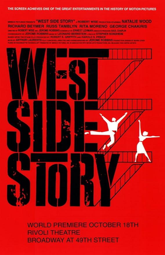
The first thing we notice is the colour. As a design choice, it’s interesting that the designers leaned so heavily with red. This ties in with a few elements, from the main characters accessories to a deeper link to the Puerto Rican heritage. Either way, the red background is BOLD, becoming even stronger when paired with the combination of black and white, forcing our eyes into the foreground.
Next the typographical design. The size and letter spacing make for a cascading effect, enhanced with the addition of changing ascenders on the ‘T’s’. Here’s where it gets interesting, the font used in the original poster was bespoke. Now this was back in 1961 so has since been recreated, the closest being Joe Caroff’s ‘Stage Left’ (fontbros, 2024). Personally, I think this is one of the key reasons why this conceptual design works so well.
So, finishing off with the graphics. We already talked about the text having a cascading effect, though this is enforced with the choice of imagery. The scene is taken from the play, were the two main characters duet on the fire escape of a Manhattan apartment. A staple of the show, and a good choice as your primary advertising. Though I think this imagery works so well, because of the sharpness of the characters. It’s interesting that after choosing such a worn-down design for the text, that the characters are the complete opposite. As if they are fresh spirits in a beaten down world… a close message to the play.
Overall, I think some incredible design choices were made with this poster, not only from a design standpoint but from that of a consumer. They created such an iconic design with only three colours whilst also advertising the theme and context of the play, ticking all the boxes on what I think makes good conceptual design.
Bad Example Of Conceptual Design
For my bad example of conceptual design, I’ve chosen the Broadway poster for ‘Cats’.
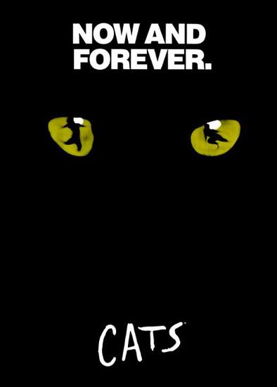
Despite my previous good example being simplistic in its components, this poster is even more so. With only two components, the title and the imagery.
Let’s discuss the title… this typeface is bespoke. Though the sans-serif script has been given an off-set baseline, making for a messy scribbled effect, however something feels lacking in the design. As for the colour it’s a crisp white, a simple choice that helps it stand out more prominently. The biggest issue with the typography is the sizing. As a design choice, I cannot fathom why on a poster with so much dead space, the title would be so compositionally small.
The next element I would edit is the imagery. It’s clear that the original concept was to incorporate the main characters from the play, whilst also in keeping the primary cat concept. This failed immensely, with what was once meant to be characters now looking like incoherent smudges.
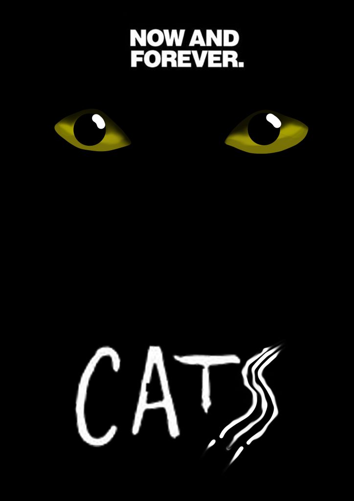
Moving on to the changes I made… I tried to stay true to the original vision, which ultimately ended with me feeling deflated. I’ve chosen to incorporate two redesigns of the poster, edited in Photoshop. One showing the original vision and the other showing my concept. The first draft was a shamble, with the changes I made trying to make the eyes more human, to reflect the characters in the show only resulting in it feeling flat. I honestly think the biggest improvement came from the title. I chose to enhance the original idea, transforming the ‘S’ into a cat scratch.
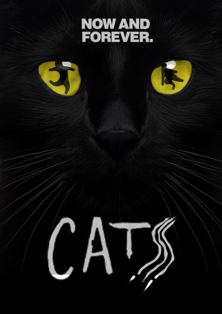
Moving on to the second attempt, taking the steps to impose a cat face into the background (Ren Zen, 2010), sharpen the characters in the eyes and edit the title. I think this one has a lot more depth and honestly, I even prefer this to the original, as I feel it makes far better use of the dead space.
References:
- MovieGoods (2009) West Side Story (Broadway) 11×17 Inch (28x44cm) Movie Poster. (https://www.amazon.co.uk/Story-Broadway-11×17-Movie-Poster/dp/B002S6UK7C [Accessed 15 Oct 2024]
- fontbros (2024) Stage Left Font Family by Harold’s Fonts. https://www.fontbros.com/font-family/stage-left/?code=harold [Accessed 15 Oct 2024]
- allposters (2024) ‘Cats (Broadway)’ Print. https://www.allposters.com/-sp/Cats-Broadway-Poster-1982-Posters_i7841878_.htm?UPI=F4O2TY0&sOrigID=144243 [Accessed 15 Oct 2024]
- Ren Zen (2010) Black Cat Face Shot Isolated on Transparent Background. https://www.freepik.com/premium-psd/black-cat-face-shot-isolated-transparent-background_126458053.htm?sign-up=google [Accessed 15 Oct 2024]