Good Example Of Composition
To show a good example of composition, I’ve gone for the movie poster for ‘The Sound of Music’. A dated choice however, one that I think has a well thought out poster design.
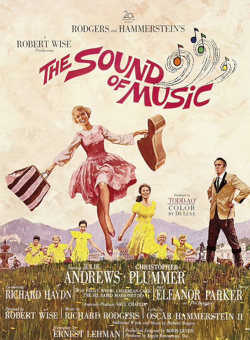
Looking at the use of dead space. Starting from the bottom, a heavy portion of the original imagery would have been dead space, with nothing more than open fields. Instead, the designers have used this space to incorporate some of the key credits from the film, a technique still used in movie posters today. This is a great use of the lower third of the design, making it look full but not busy, almost like flowers from a distance.
The second key area of dead space is around the title. Using a retro font with a wavey baseline gives an incredible effect, looking like music in the wind. One of the main ways this works, is due to the sizing. Having the title be slightly compositionally smaller and the second line offset to the right, allows for a large area of dead space around the focal point… the main character.
The composition of Julie Andrews character is genius in this poster. First, look at the way her figure is posed… arms out, consuming as much space as possible, though paired with narrow legs. This gives us an overall diamond shape, instantly drawing our eyes in. Becoming more dominant when paired with the triangular shape provided by the background characters.
The final element to look at, is Chistopher Plummer’s character off set to the right. This separates him from the triangular shape we previously discussed. Though much like Julie’s character his posing is also spread out, making a smaller diamond shaping, this works well at signifying him as the other key character.
Overall, I think this design is a very well thought out example of composition. The use of colour and shaping through character posing, mixed with cleverly designed typography makes for an excellent poster.
Bad Example Of Composition
Somebody once told me that the key to good art is knowing when to stop, something ‘The Shrek Musical’ poster clearly didn’t understand. That’s why I’ve chosen this Broadway poster as my bad example of composition.
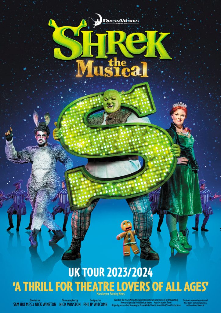
Unlike my previous example, this design struggles largely with its use of dead space. Filling what little of it there is with glitter and ombre background that ultimately results in the characters looking as though they are floating. The whole thing is very messy.
The first being the straight compositional line made by the background characters, that cuts the page in half. Then the other side characters, who are both clearly photoshopped into the poster, neither with the correct lighting. Though the main reason I feel this doesn’t work is due to the posing. One is largely spread out, whilst the other is squashed in on themselves, making for an unbalanced and unappealing visual for the eye.
The two saving graces, come from the main character and the title. The composition of the large ‘S’ makes for an excellent focal point and despite being generic, the title pairs well in the centre of the poster.

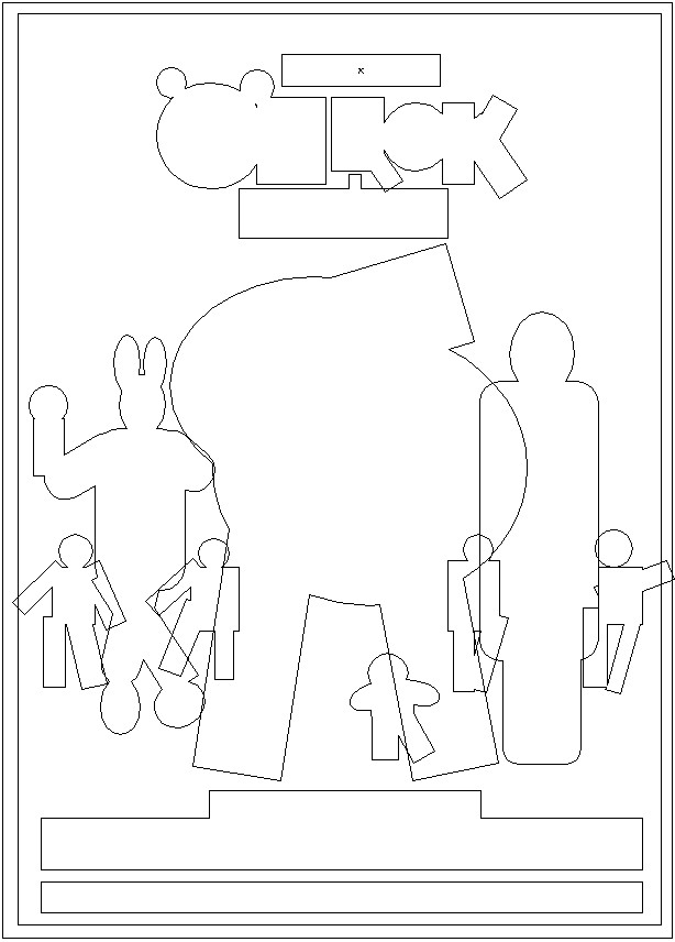
Loading into Adobe Illustrator, I showed the bad compositional design of this piece by blocking out all the key components and assigning colours to each element. Primarily using the circle and rectangular shapes to build rough outlines and then selecting the ‘Unite’ feature in pathfinder to make the individual components into one overall shape.

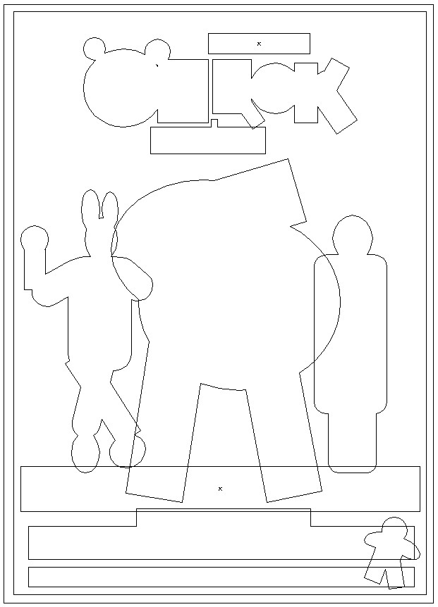
The initial blocked out composition for this poster was very cluttered, as I suspected it would be. With even the differentiating colours making it hard to decipher the overall design. Viewing the outlines, I added a platform and removed and moved several characters around, even resizing the one on the right to help create a more symmetrical image and resized the title for more of a focal point.
Overall, this resulted in a far more legible all-star design, with a better use of dead space.
References:
- E Collection (2024) Sound Of Music – elegant poster. https://www.photowall.co.uk/sound-of-music-2-poster [Accessed 19 Oct 2024]
- Mark Goucher (2022) Steph Pyne Design – Shrek The Musical. https://stephpyne.com/shrek-the-musical-uk-tour-poster-design [Accessed 19 Oct 2024]