Good Example Of Colour
For my good example of colour theory, I’ve chosen to look at the Broadway poster for ‘Dear Evan Hansen’.

Looking into Broadway posters, one of the biggest denominators is block hues. Be it, Lion King, Wicked or Grease… these designs stem from block complimentary colouring and zero shading. One of the main reasons ‘Dear Evan Hansen’ stands out is through the consistent use of shading.
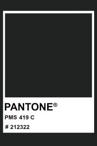
First the typography. The colour pallet is very simple with multiple shades of blue. Starting with ‘Dear Evan Hansen’ blue, a bespoke colour created by Pantone (Stacy Mindich, 1995). Followed by Pantone 6104C, a darker shade of blue. Then finally to what most would perceive as just black, but is Pantone 419C, a darkened grey. Overall, the three colours combine to create block ombre effect, forcing your eye to follow the text in a downwards motion.


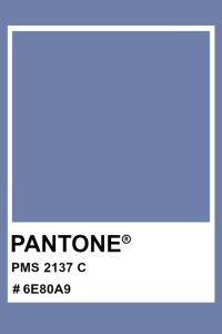
Moving onto the imagery, continuing with an altered palette of blue hues and whites. However, one hue is repeated in this stage, Pantone 6104C… our dark blue. This hue is primarily used to represent shadowing. Fascinating that instead of using harsh blacks to depict shadows, the designer has instead chosen to use a blue hue, in keeping with the softness of this design, and helping in creating a saddened emotion to this piece. Our next most dominant colour at this stage, is Pantone 2137C a blue hue with a grey undertone. This colour is used heavily in the detailing of the imagery, another clever design choice to signify shading and depth to the piece.
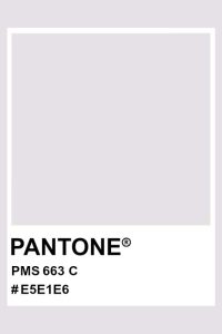
The final element to note is the colour choice for the skin, with Pantone 663C. Whilst most would associate skin with a pale pink or peach, this design instead uses a grey-scale, a clever technique used to make our brains associate the character with sickness.
Overall, I think this poster uses a very minimal colour pallet to not only create an interesting image but also portray an array of emotions, helping to connect the audience from the offset.
Bad Example Of Colour
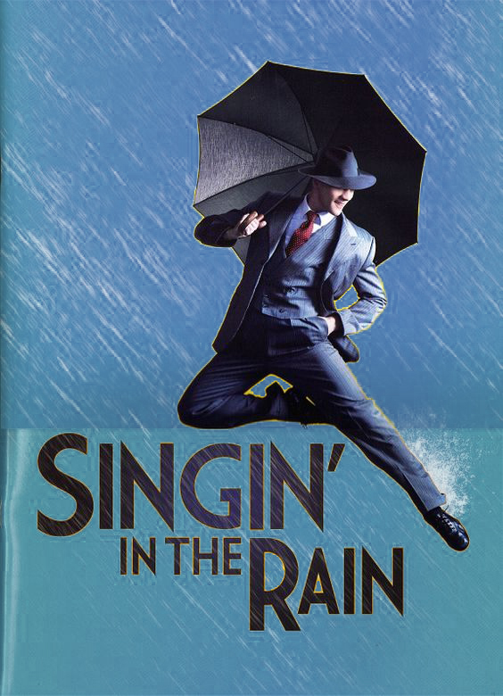
For my bad example of colour theory, I’ve chosen the Broadway poster for ‘Singin in the Rain’.
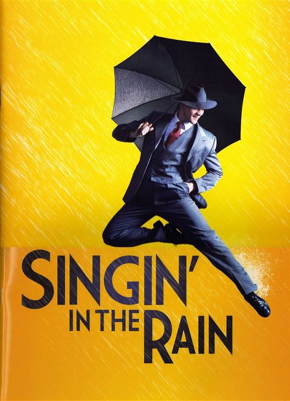
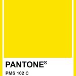
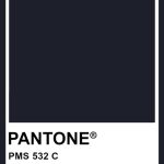
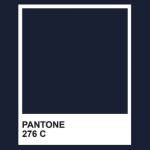
This design focuses heavily on the use of bold striking hues. The most prominent of which, is the harsh yellow of Pantone 102C. This becomes even more problematic when paired with the analogous of Pantone 532C, a hue that should in theory compliment our preexisting colour but instead looks isolated from the design. This is also incessant in the typography, with the use of Pantone 276C, a slightly darker blue hue to 532C. This again encourages the viewer to feel disconnected from the theme and message behind the design… with the imagery and text conveying a stormy disposition, conflicting with the sunshine nature of the background.
Going forward with this design, the key element I wanted to change was the hue of the background, focusing more on expanding the preexisting blue hues. My primary reasoning behind this decision, was because I wanted to convey a melancholy mood to the audience. When you think of rain, you think of blue droplets and grey skies. It would have been a poor design choice to brighten the text and imagery to a yellow hue, as you would have lost some of the detailing.
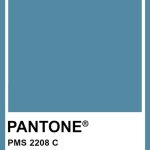
Moving forward, using Adobe Illustrator, my first step was to use the ‘Blob brush’ to create a wall of colour as an overlay to the background. Making sure to have all elements of the background separate from the other components. From this, I edited the hue and saturation, making use of the Pantone colour book. As my finished result, I ended on Pantone 2159C and Pantone 2208C as my two primary blue hues.

Overall, this concept is just a rough example of design choices I think should have been made instead for this piece. I think the design is still very rough, but editing one of the prominent colours has had the desired effects in changing the mood of the piece.
References:
- prints4u.net (2024) Dear Evan Hansen Musical Theatre Poster Print. https://www.prints4u.net/product/dear-evan-hansen-musical-theatre-poster/ [Accessed 27 Oct 2024]
- Stacy Mindich (1995) PANTONE USA ‘Dear Evan Hansen Blue’: A Bespoke Shade to Commemorate the Production’s Iconic Hue. https://www.pantone.com/articles/case-studies/dear-evan-hansen-blue-a-bespoke-shade-to-commemorate-the-productions-iconic-hue#:~:text=’Dear%20Evan%20Hansen%20Blue’:,Commemorate%20the%20Production’s%20Iconic%20Hue [Accessed 27 Oct 2024]
- The Colour Alchemist (2024) Pantone 6104C. https://in.pinterest.com/pin/1090926709727539704/ [Accessed 27 Oct 2024]
- RitaB (2024) Pantone 419C. https://in.pinterest.com/pin/10273905392306528/ [Accessed 27 Oct 2024]
- RitaB (2024) Pantone 2137C. https://uk.pinterest.com/pin/828380925198099837/ [Accessed 27 Oct 2024]
- RitaB (2024) Pantone 663C. https://uk.pinterest.com/pin/828380925196702039/ [Accessed 27 Oct 2024]
- pinterest.com (2024) Singing in the rain. https://uk.pinterest.com/pin/23784704253897028/ [Accessed 27 Oct 2024]
- RitaB (2024) Pantone PMS 102. https://uk.pinterest.com/pin/546413367294197303/ [Accessed 27 Oct 2024]
- RitaB (2024) Pantone 532C. https://tr.pinterest.com/pin/513058582552471962/ [Accessed 27 Oct 2024]
- metroxing (2024) Pantone 276C. https://uk.pinterest.com/pin/407998047494205987/ [Accessed 27 Oct 2024]
- emma-wutson (2024) Blue Ridge Mountaibs Pantone Sticker. https://www.redbubble.com/i/sticker/Blue-Ridge-Mountains-Pantone-by-emma-wutson/77331373.EJUG5 [Accessed 27 Oct 2024]
- RitaB (2024) C Pantone 2208C. https://br.pinterest.com/pin/828380925198124851/ [Accessed 27 Oct 2024]