Bonnie Siegler once said, “Your choice of typeface is as important as what you do with it” (Sandra Karan, 2024)1. With this in mind, my first step was to take a deeper look into different typographical styles of font. Using different fonts, baselines, letter spacing and initials to create several rough designs.
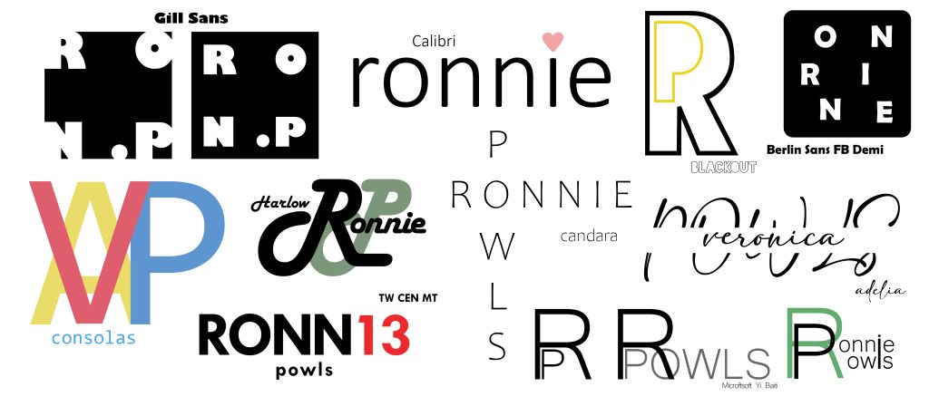
During my initial design stage, I experimented with a variety of colours and fonts, also playing around with different variations of my name. This resulted in thirteen different concepts for my ‘typographical logo’. Despite each font being radically different from one another, I still clearly have a bias, as they are all sans-serif fonts.
The first design is my favorite of the two, with my initials ‘VAP’. My first design choice, was to incorporate the three primary colours as my three initials. Starting with this concept, I then softened the colour pallet to a more pastel variant. Moving on to composition, using the font ‘Consolas’ in all caps. Keeping the baseline intact, I chose to overlay the lettering on top of one another. Bringing them into alignment and removing the letter spacing, making sure the overlay was symmetrical. Overall, this added massively to finished result, with the V and A mirroring one another.
For my second logo, I chose to go in a different direction, primarily focusing on my nickname. Using the font ‘TW Cen MT’, incorporated with a harsher colour pallet of black and red, resulted in a very contrasting design. One of the biggest contrasting components of this design, comes from the letter spacing. With the previous logo having none, I instead chose three different variations, used throughout the initial name, numbering and surname. Another choice I made is using numbers, changing the ‘IE’ into a 13. Not a personal decision, but a legible design choice.
Overall, I think despite their contrasting nature, both designs individually work well.
References:
- Sandra Karan (2024) Choice of TYPEFACE Bonnie Siegler. https://uk.pinterest.com/pin/397442735845618025/ [Accessed 4 Nov 2024] ↩︎