Due to my lack of experience in Adobe Illustrator, I wanted to keep my self-portraits on the simpler side of things. Focusing on simple cel-shading and bold lines, I created two portraits in contrasting designs.

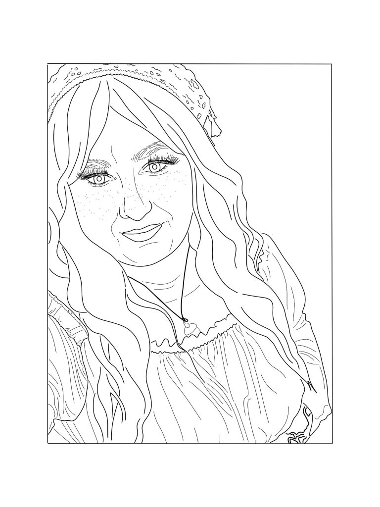
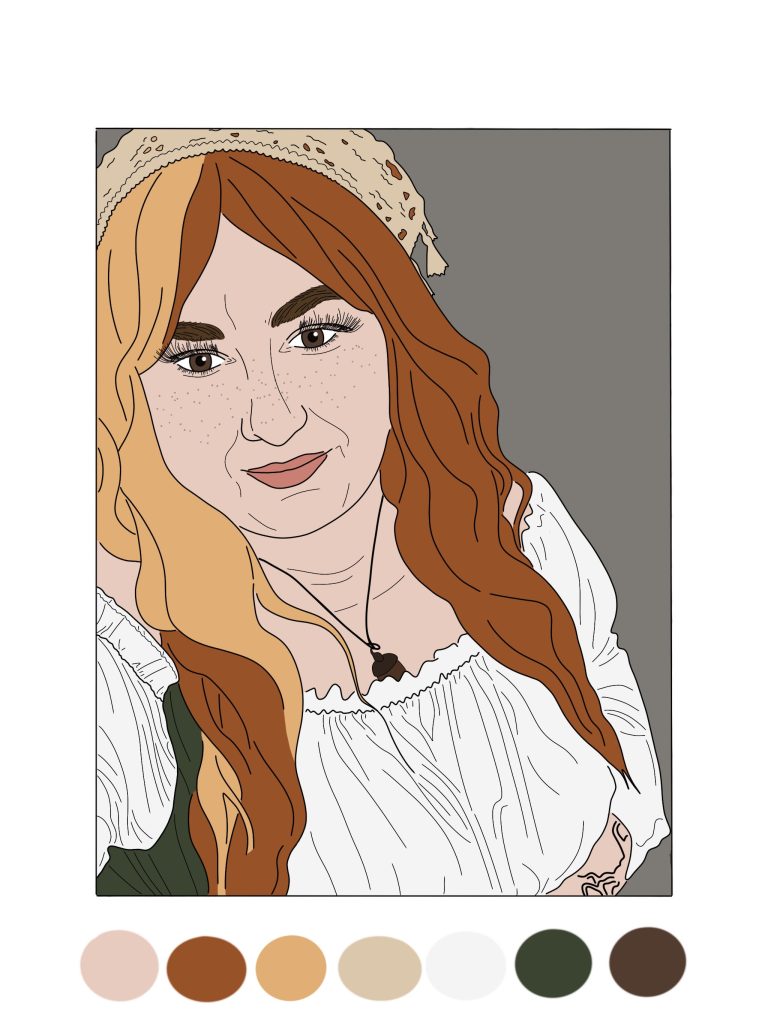
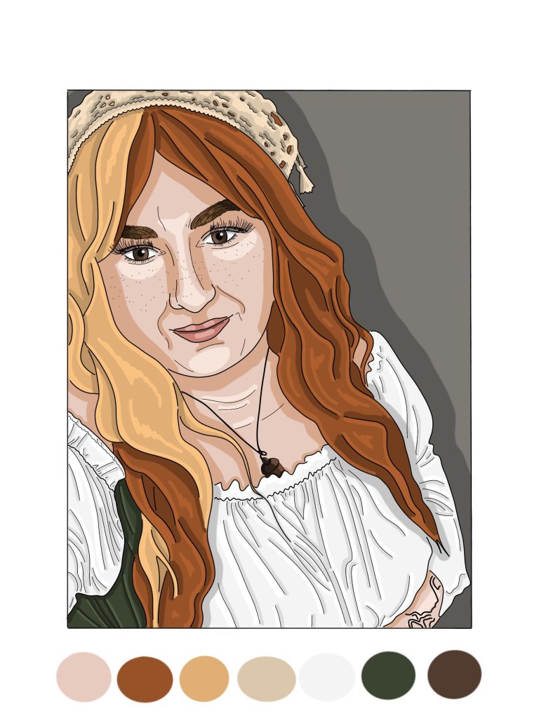
For my first self-portrait, I chose a more realistic approach. Taking a pre-existing photo of myself, increasing the opacity, and tracing the key lines using the paintbrush tool. To make this easier, I added a higher stabilizer to the brush, allowing me to have smoother lines. From this, I then began to add several layers of colour, sampling from the original photograph, making sure my initial line-work stayed prominently on the top. After establishing the base layers of colour, I then used a thinner brush size to add highlighting and contrasting colouring on a new layer. I chose not to blend these colours together, primarily due to a lack of experience in this software. However, the finished result is a detailed rendition of the original image.


(animalcrossing.nintendo.com, 2001).
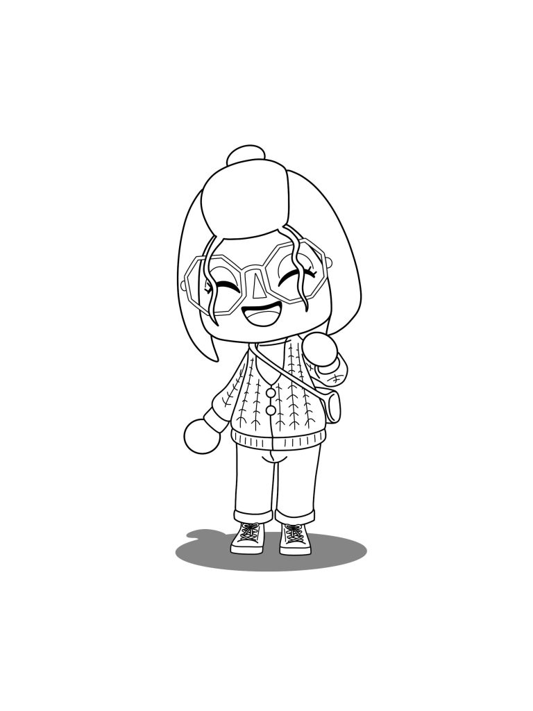
Moving on to my second piece, I chose a more stylized design, inspired by my character in the video game ‘Animal Crossing’ (animalcrossing.nintendo.com, 2001)1. My initial step was to design my character in the game, trying to add elements I felt reflected me best. From this I photographed the character, to help as a visual aid. The only contrasting design choice I made, was I chose to edit my character slightly. Limited by the catalogue of the game, I chose to change my hair and coloring’s of both my bag and shoes. After this, I followed the same steps as my previous piece, tracing, block colour and highlight and contouring. Despite using the same technique as my previous design, the results are radically different. With the cel-shading definitely complimenting the video game style more.
Overall, these two pieces reflect my Adobe Illustrator abilities well, whilst also encapsulation my personality.
References:
- animalcrossing.nintendo.com (2001) Animal Crossing Series- Official Site. https://animalcrossing.nintendo.com/ [Accessed 15 Nov 2024] ↩︎