Moving onto the next stage in this project, I wanted my two designs to focus more heavily on key elements of my personality and interests.
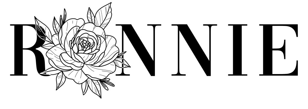
The first of the two designs is inspired by my love of tattoos, focusing on line-work in a grey-scale palette. As an initial concept, I played around with each individual letter of my nickname, trying to find an appropriate way to incorporate a tattoo like element. I felt the ‘O’ worked best, as it gave me more options overall. For the final design, I settled on a rose, which I then designed in the tattoo art style of Neo Traditional. I chose not to incorporate colour into this design, to mimic my own tattoos, though I also think the piece looks more stylized in a grey-scale pallet. To finish this design, I wanted the font choice to also incorporate both thin and bold strokes, much like the illustration. With this in mind, I settled on the ‘Vogue’ font style. An iconic typeface, that I think adds to the tattoo like nature of this Logo.
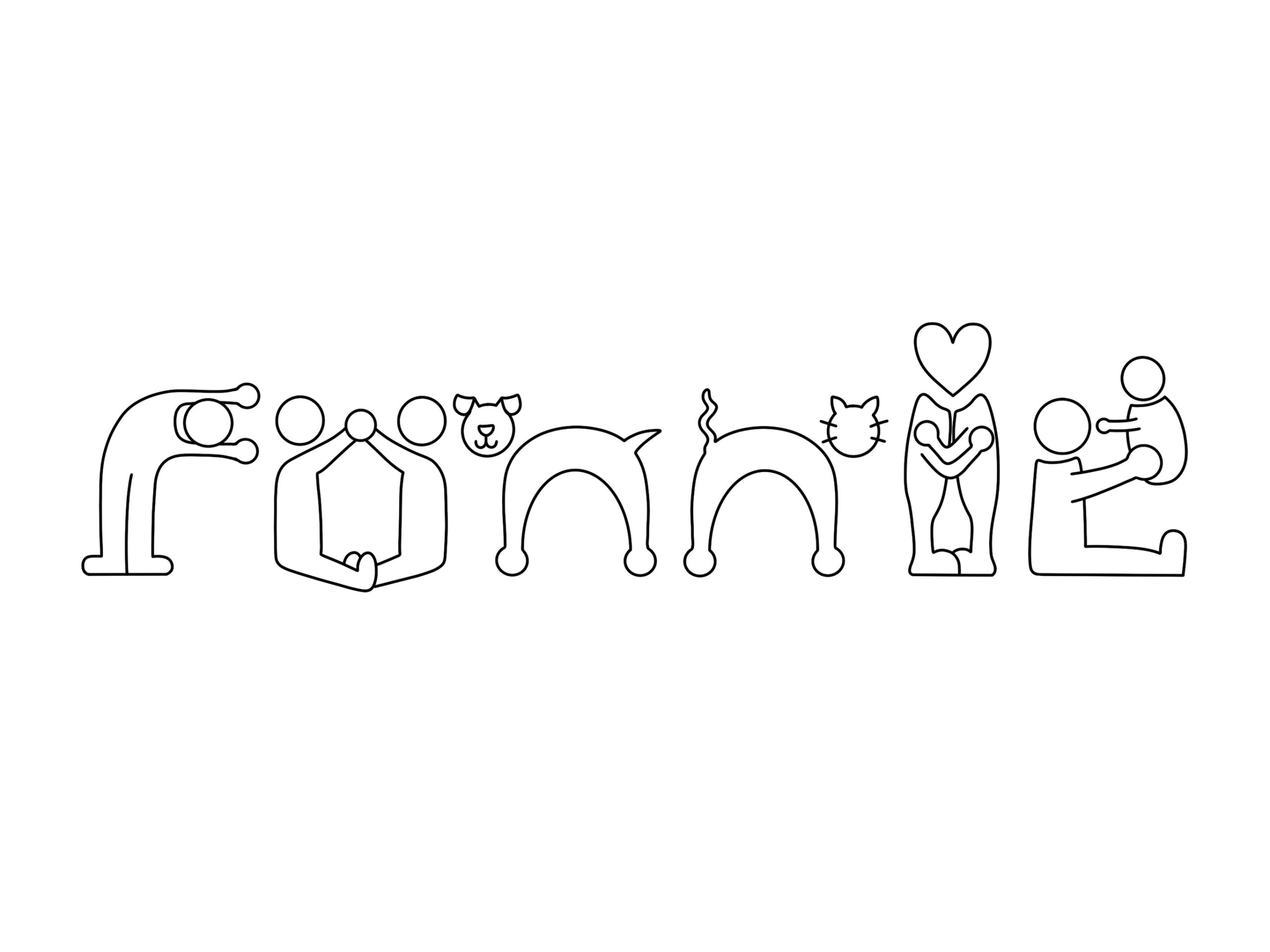
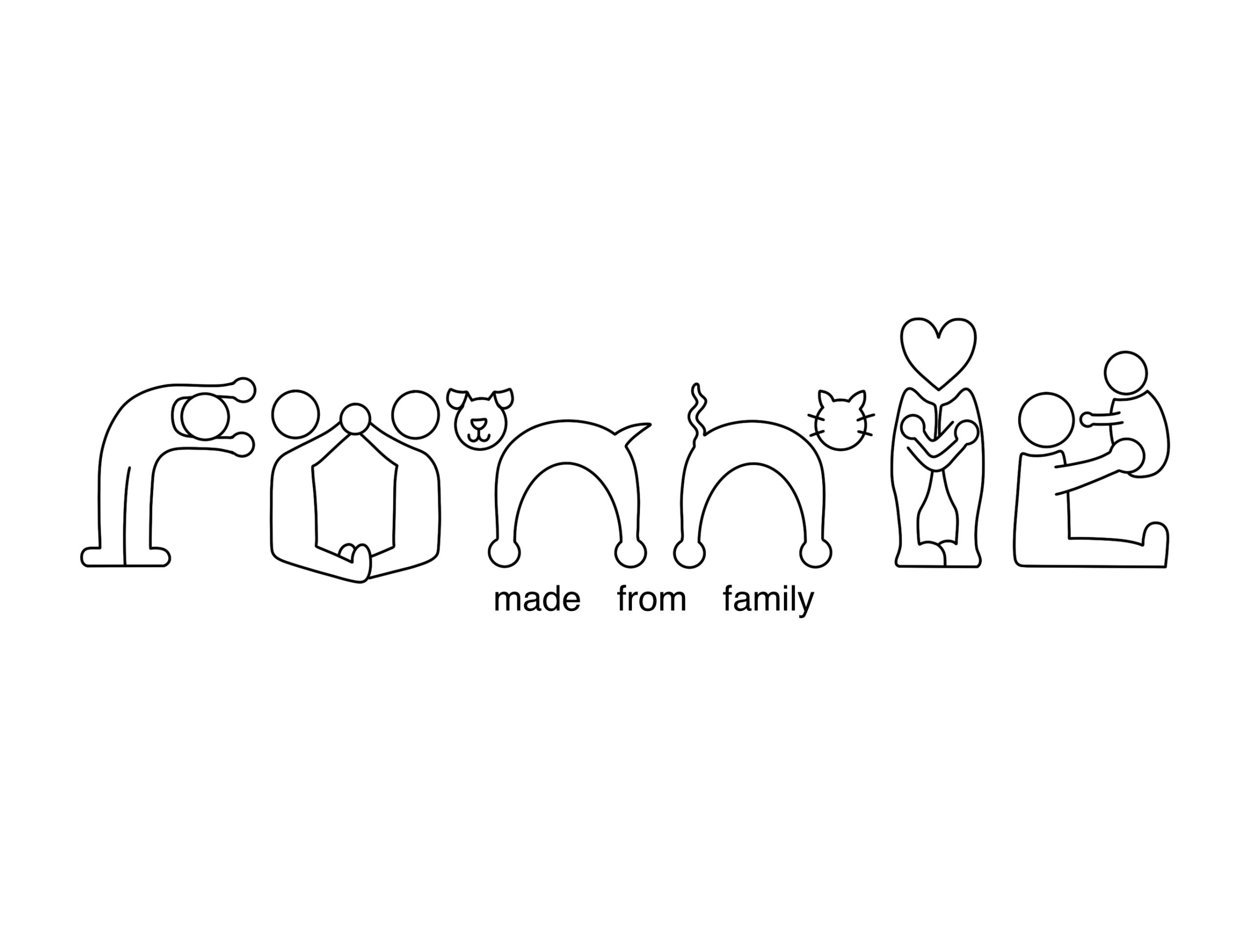
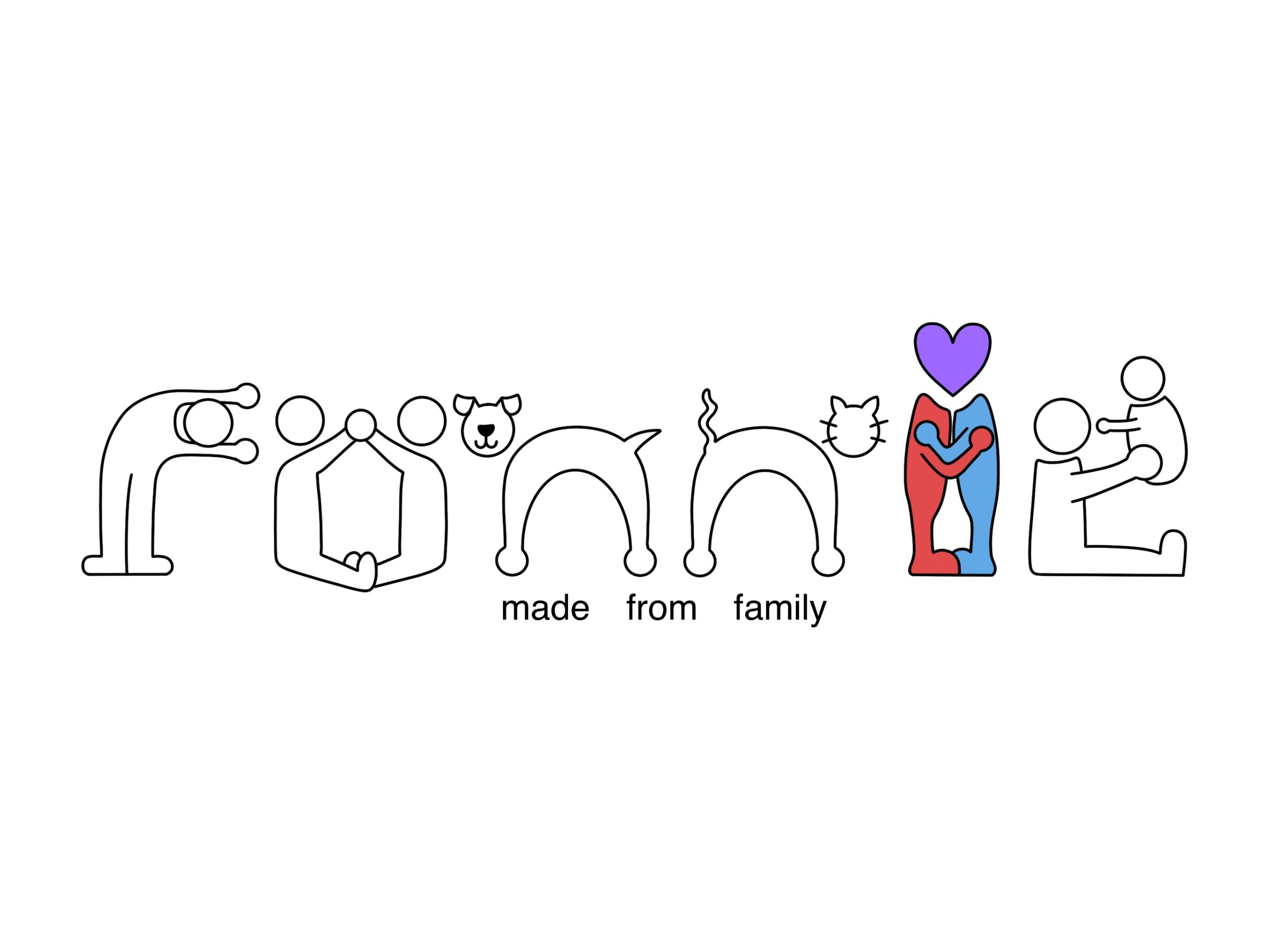
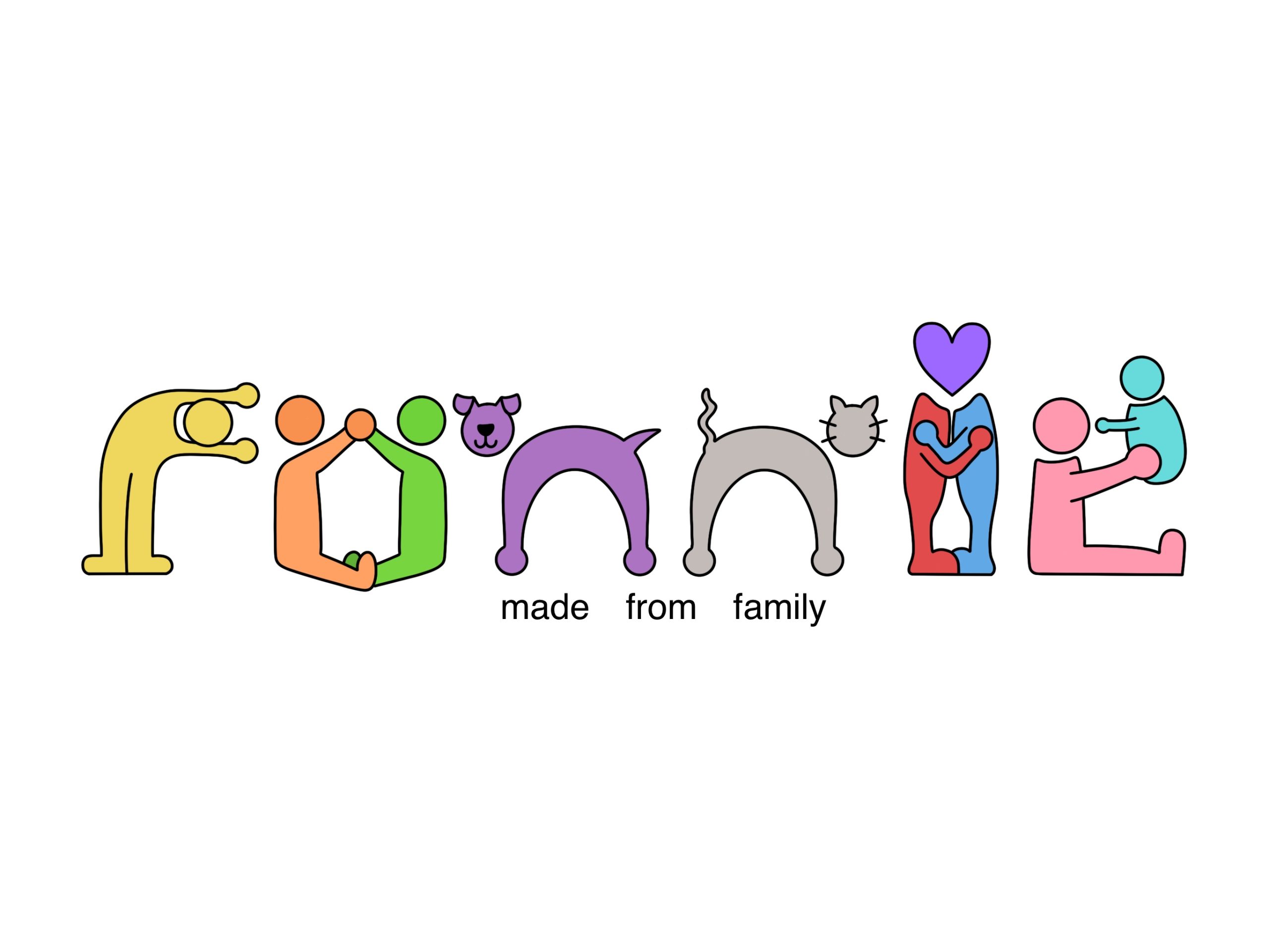
For my second design, I focused on a huge part of what makes me who I am… my family. My initial concept was loosely influenced by the 2009 Change4Life campaign (family-action.org.uk, 2009)1. Beginning with the concept of Play-Doh like men with floating heads in an array of primary and secondary colours. Using a consistent baseline and letter spacing, I began to shape these characters into letters. To incorporate my family into this design, I tried to have each character reflect them. The ‘R’ being my brother, the ‘O’ my parents, both ‘N’s as household pets, the ‘I’ as me and my partner, and finally the ‘E’ as my nanna. Overall, this logo couldn’t be more me, with each element summarizing my core perfectly.
To conclude, I like the contrasting nature of these conceptual logos, be it through style or colour. Each represents key elements of who I am, whilst also demonstrating different techniques.
References:
- family-action.org.uk (2009) Change4Life Service – Family Action. https://family-action.org.uk/change4life/ [Accessed 15 Nov 2024] ↩︎