As a starting point for this project, I knew that my primary focus would follow on from my previous studies, focusing on the eclectic styles of musical theatre. With this in mind, I chose to focus on three individual shows, all with opposing styles and colour palettes.
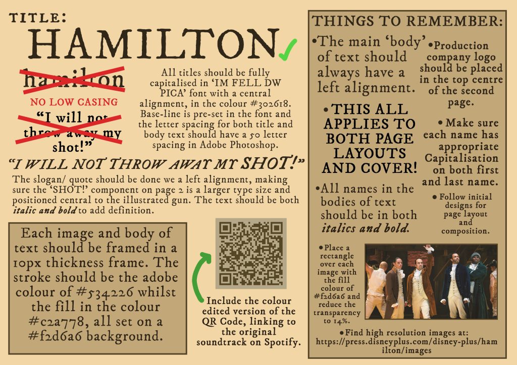
Starting with the Broadway show, Hamilton. I had a clear vision in mind for what I wanted both, the cover and the informative pages to look like. As the play is set in the 18th century, it felt appropriate to try and encapsulate that time period through graphic design. After thorough research, I found that the most era-appropriate font was actually one I’ve looked into in the past, ‘IM Fell DW Pica’ 1. I chose to use ‘IM Fell’ as it captures the ‘handmade’ type style I wanted. Radiating the same style as the 18th century works of John Baskerville and his use of the print press 2, only slightly bolder.
Moving onto my choice in colour palette. Whilst most publication of the 18th century were printed in black and white, due to aging, discoloration has occurred. This is what I aim to convey throughout my pieces. Choosing a ‘Sepia’ approach, focusing on more yellows and browns.
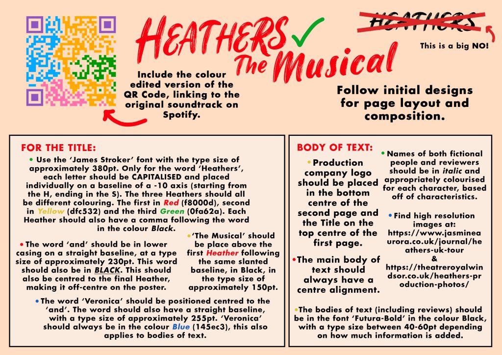
For my second focal point, I chose the Broadway adaption of the classic 80’s movie, Heathers. Unlike the previous show, Heathers focuses very heavily on primary and secondary colours. Using high pigmentation and thick fonts.
The original font I wanted to use for this project was a font by the name of ‘Steak Brush’ by Goldlake Graphic Company 3. It’s a much stronger font, that certainly translates a more ‘psycho killer’ attitude, really amplifying that 80’s slasher feel. Unfortunately, it’s locked behind a paywall that honestly, I simply refuse to pay. Ultimately, I settled on the loosely inspired (and free) ‘James Stroker’ typeface 4. I feel that it mimics the material girl, lipstick component I was aiming for, especially when amplified by a highly pigmented red.
As for the informative pages, I was inspired by the yearbook style. After researching, I found that ‘Futura Black’5 would work best with my vision. This provided me with not only a strong font, with 80’s undertones, but also a legible one… Far more appropriate for the contents, as opposed to the cover.
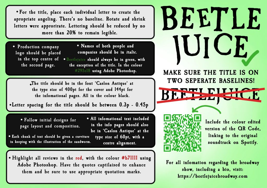
Rounding off my set of three, I chose to do another Broadway adaptation of an 80’s classic, Beetlejuice. Unlike its counterpart ‘Heathers’, Beetlejuice chooses to focus much more on the ‘strange and unusual’ elements of the decade.
Starting off with the colour palette, with the use of only four major colours throughout. Black, White, Green and the tiniest amount of red. Chosen specifically to translate a dead and decayed effect through the use of green, only to have the harsh contrast of a monochromatic typography.
As for my choice in font, I tried to emulate the original poster design as closely as possible. I did this, as I felt the original typographical design choice really helped amplify the tilted and unhinged-like nature of Beetlejuice. I felt the ‘Caslon Antique’ font6 mimicked this well, especially with a slightly irregular baseline used for the title. This font was also incredibly appropriate for the contents, as when not edited or angled, the font was very legible, whilst still translating the ‘Gothic’ aesthetic.
References
- Adobe (2025) Free Online QR Code Generator. https://www.adobe.com/express/feature/image/qr-code-generator?gclid=CjwKCAiA34S7BhAtEiwACZzv4XBO3TfxrPDhw_ogF8wDUjNgV0JBL0cilBvSEM05A1v0TzcyBSlX2xoCfeMQAvD_BwE&mv=search&mv2=paidsearch&sdid=88X75GP8&ef_id=CjwKCAiA34S7BhAtEiwACZzv4XBO3TfxrPDhw_ogF8wDUjNgV0JBL0cilBvSEM05A1v0TzcyBSlX2xoCfeMQAvD_BwE:G:s&s_kwcid=AL!3085!3!718111565734!b!!g!!custom%20qr%20code%20generator!21452545372!170096922451&gad_source=1 [Accessed 3 Jan 2025]
- Disney (2025) Images Disney Plus Press. https://press.disneyplus.com/disney-plus/hamilton/images? [Accessed 3 Jan 2025]
- Igino Marini (2025) IM FELL Types Font. https://www.dafont.com/im-fell-types.font [Accessed 3 Jan 2025] ↩︎
- prepressure (2025) 1750 – 1799 The History of printing during the 18th century. https://www.prepressure.com/printing/history/1750-1799 [Accessed 3 Jan 2025] ↩︎
- Goldlake Graphic (Dec 05 2013) GL Steak Brush, a Script Font by GOLDLAKE GRAPHIC. https://creativemarket.com/bhimabagaskara/17513-GL-Steak-Brush?u=dafont [Accessed 3 Jan 2025] ↩︎
- cove703 (2025) James Stroker Font. https://www.dafont.com/james-stroker.font?fpp=100&psize=l&text=Lipstick [Accessed 3 Jan 2025] ↩︎
- Paul Renner (1927) Futura in Use. https://fontsinuse.com/typefaces/4/futura [Accessed 3 Jan 2025] ↩︎
- fontbolt (2025) Beetlejuice Font Generator- Free Download. https://www.fontbolt.com/font/beetlejuice-font/ [Accessed 3 Jan 2025] ↩︎