Wrapping up my project, I chose to focus on my three theatre productions. Focusing on creating three distinctive cover designs, that established a clear theme and colour palette throughout.

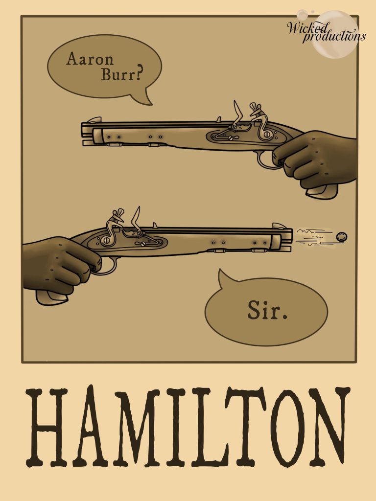
Starting, with Hamilton. Like my editorial pages, I thought the best approach to gather feedback was to create another set of rough designs. This helped change things at an early stage.
One of the initial pieces of feedback I was given on this design was, yet again, the guns. Much like my previous issue, people still felt they looked as though they were floating. Thankfully this was an easy fix. Instead of creating brand new illustrations for the cover, I simply copied my previous design. Having two sets as opposed to the single gun.
Next came the speech bubbles. After receiving positive feedback on the concept, I still chose to edit one element. Punctuation. In-keeping with the original plot of Hamilton, I chose to pose the top name as a question. Making it as though Hamilton was asking Burr if he was really going to shoot. This was a minor detail that I think received no feedback due to the niche referencing. However, despite not essential, I think adds consideration to the design process.

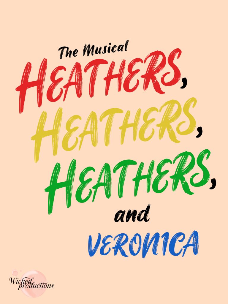
Moving onto Heathers. My primary focus for this cover was to create a design that fully relied on typography. This is something that didn’t translate well in the feedback stage. A large portion of the responses thought that the design was “too bland” and “off theme”. After the extremely populated contents of the informational pages, I wanted a more streamlined approach in the cover. After hearing the feedback, I made a judgement call to ignore my peers, chalking it up to lack of vision.
After making only a minor adjustment of adding ‘The Musical’ to the cover and adjusting the hue and saturation of my brands logo. I didn’t change anything else. Keeping the font in the originally planned ‘James Stroker’ typeface and choosing a colour palette that not only reflected the programme pages but also the characters in the production.
Overall, I think the cover is certainly “on theme” though an argument could still be made for bland. I think it comes down to personal preference, and in my case, I think less is more.

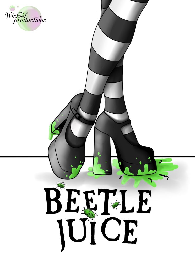
Finally, Beetlejuice. After fighting so much with the feedback on Heathers, the advice given to me on Beetlejuice really did change the cover.
At an early stage of the concept, a peer suggested I change the leg design to two, preferably with a more feminine touch. Stating they felt it would translate the main character ‘Lydia’ more appropriately.
This was the only big piece of feedback I received for this design, and of all my pieces, the most useful. Changing the concept into two legs, with a pointed toe and a more feminine shape, completely changed the flow of the eye. Instead of a blocky movement down into the title, the piece was given more fluid transition and a 3D nature.
Following this, the same peer also suggested I keep my logo in the original colour palette suggesting “it complements the green”. After toying with the design, I agree that the original logo is still in-keeping with the theme, without taking away from the focal points of the design.
References
- Igino Marini (2025) IM FELL Types Font. https://www.dafont.com/im-fell-types.font [Accessed 3 Jan 2025] ↩︎
- cove703 (2025) James Stroker Font. https://www.dafont.com/james-stroker.font?fpp=100&psize=l&text=Lipstick [Accessed 3 Jan 2025] ↩︎
- fontbolt (2025) Beetlejuice Font Generator- Free Download. https://www.fontbolt.com/font/beetlejuice-font/ [Accessed 3 Jan 2025] ↩︎