When it came to the design stage of this project, I ended up creating three different low fidelity UI prototypes. I chose to only design the homepages, as I felt this was the best way to navigate my options and show a variation of styles, before committing to final prototype.
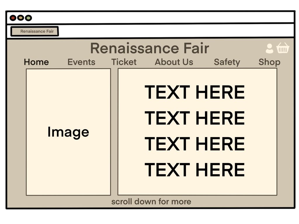
For my first rendition, I wanted to focus on the most minimal approach, creating a clean and relatively simple layout. Whilst the design was easy to navigate, nothing about the concept screamed ‘Ren Fair’. If I had chosen to go forward with this prototype, there are elements I feel I would need to address. Primarily the font and colour choice, as the page as a whole reads like a sad dated newspaper. I think with a brighter colour pallet and the correct typeface, this prototype would have been a more viable option.
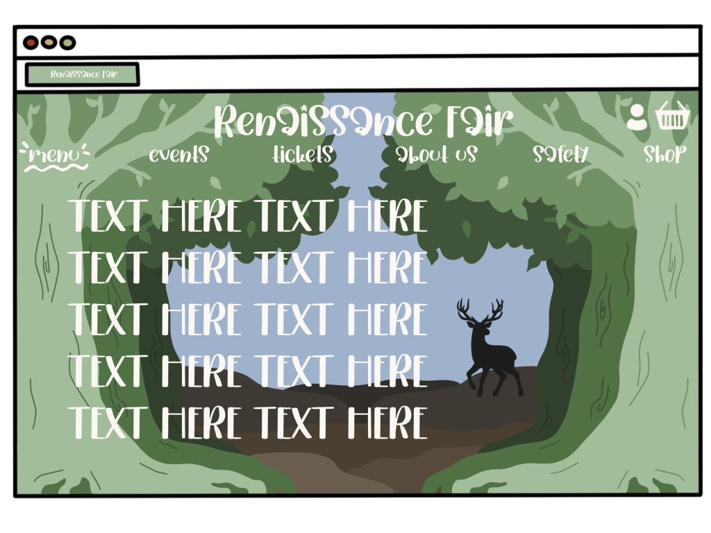
Moving into my second concept, I decided to target the opposite end of the spectrum by creating a more illustrative design. Instead of seeing the brief as a website, I instead decided to construct a piece of art. Despite using this approach, I still instilled Jakob’s Law (E. Stevens, 2024) and stuck to my original concepts in regard to the positioning of my titles and text. Whilst there’s nothing I would change about this design, I still rejected it for my final option. This in large, was due to my users. Even though I enjoyed the design, I could clearly see how for an older user trying to access key information, the website could quickly become confusing.
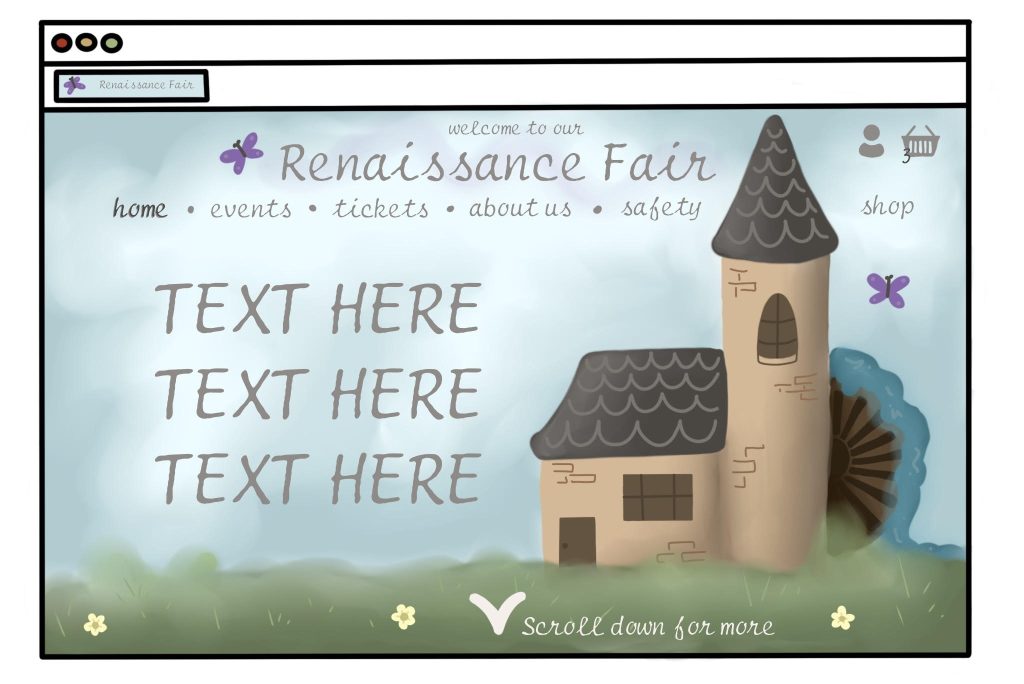
With my previous prototypes in mind, I then created my third. This was the layout I chose to move forward with when designing both my storyboards and wireframe renditions and is a layout I’ve already spoken about in length in previous blogs. However, I would still like to address that I chose to incorporate elements from both of my previous designs. Resulting in a blend between both usability and aesthetic when constructing my prototype.
References
- Emily Stevens (2024) What are the laws of UX? All 21 laws explained. https://www.uxdesigninstitute.com/blog/laws-of-ux/ [Accessed 15 Mar 2025]