“You have to have a strategy, and you also have to be able to visualize it” – wise words by Erik Spiekermann on the subject of typography in graphic design (M. Yalanska, 2025). When starting this project, I knew I had a clear vision for what I wanted to create.
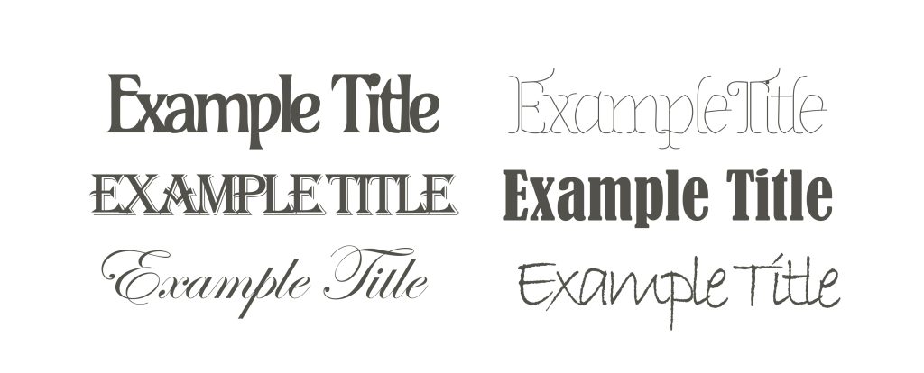
Though I wasn’t yet sure of the specific fonts and colourings I wanted to instil throughout my design, I had found my inspiration. I wanted my typography choice to reflect children’s fantasy storybooks. After researching several typefaces, I found an article on the font ‘Almendra’ depicting it usability in children’s books. With generous spacing and a tall x-height, ‘Almendra’ is designed to enhance readability even in dense passages and is designed to accompany subjects such as magic and traditions (H. Shu, 2025). Exactly the type of features I was looking for, especially when paired with the long-winded guidelines included in a Ren Faire website. After experimenting with the letter spacing and sizing. I found that with my title, a clean 100pt with a line height of 50 and a letter spacing of -10, allowed my font to look clean and structured without taking away from the content of the pages. Given as this was the most important element of design, I still chose to run this decision by my peers and gather any possible feedback. This resulted in only positive feedback, with several people drawing the storybook parallels without any suggestions.
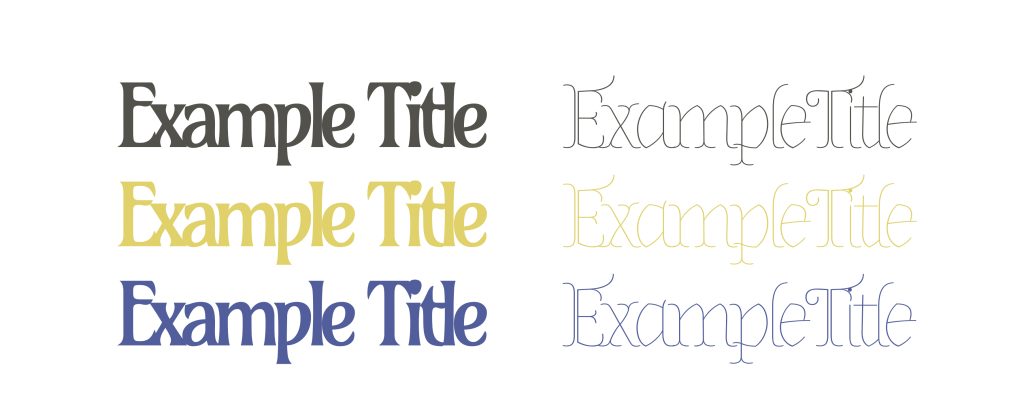
Moving into my colour palette, I already had several ideas in place. Thanks to my previous research where I chose to create four mood boards, I had already found several visual references. This gave some idea of where to start, though I still wanted to learn more about the history and symbolism of certain colours throughout the Renaissance Period, especially in their art. I learnt that even though one would naturally associate Yellows and Red with this period of time, these colours were usually used to depict wealth (R. C. Researcher, 2011). This led me to lean more into the opposite end of the spectrum, focusing more on the muted palette of this era. Turning my attention to soft greens, blues and browns. A way to symbolize not necessarily poverty or peasants, but more a grounded-ness and affordability to my product. When brought to my peers for feedback, most settled on the darkened brown shade of #52524B for the font, finding that text was more legible when paired with my typographical choice. Despite this, I still felt as though the font was slightly lost against the busyness of the backgrounds. This led me to use text background in the colour #EBE1DC, a soft cream that helped bring my information to the foreground. As not to take away from the illustrations on my site, I opted to reduce this colours opacity to 60%, ultimately resulting in a clearer combination of every element in my design.
References
- Hua Shu (2025) Almendra: The Ideal Calligraphy Typeface for Childrens’s Books and Long Text. https://typogram.co/font-discovery/how-to-use-almendra-font [Accessed 14 Apr 2025]
- Marina Yalanska (2025) 20 Wise Thoughts by Typography Master Erik Spiekermann. https://blog.tubikstudio.com/20-wise-thoughts-by-typography-master-erik-spiekermann/ [Accessed 14 Apr 2025]
- Renaissance Clothing Researcher (2011) Renaissance Clothing: The Meaning of Renaissance and Medieval Clothing Colors. https://renaissanceclothing.blogspot.com/2011/02/meaning-of-renaissance-and-medieval.html [Accessed 14 Apr 2025]