The Participatory Collective
“Change moves at the speed of trust” (S. Covey, 2008) is a quote that perfectly encapsulates the mission of ‘The Participatory Collective’. Elaborating for those at home, ‘The PC’ is a privately funded organisation by ‘The Ideas Fund’ (Ideas Fund, 2025), designed to give the vast communities of Kingston Upon Hull a voice. Working with over sixteen different communities and charities, their goal is to nourish each unique area by creating a platform for every community to share their story. By creating an online presence and social media campaign for this group, we are allowing them the opportunity to show that every voice deserves to be heard. Joining sixteen projects together, allowing them to share and learn from one another.
Community Research
To really understand the mission of ‘The Participatory Collective’, and who they are as a client, I set about researching each of their communities. As I previously stated, this project is built up of sixteen induvial communities which we aim to connect through the use of one overall umbrella organisation. Each group is tied together through their involvement with ‘The Ideas Fund’ (Ideas Fund, 2025), with all of them receiving different levels of support in their projects. Every one of their projects was unique, with some receiving funding for children struggling with grief, to others working to bring more acceptance in religious environments.
Due to this vast array of goals, I created a Figjam board that summarises each group and their projects. I felt this was the cleanest way to show all the information I found. One of the biggest pieces of information I set about finding was what each group stands for. While I do agree that it’s important to look at ‘The Participatory Collective’ as a whole, I didn’t want to lose the individual messages of the people involved when it came to my designs.
Though this was all incredibly useful, due to the early stages of some of these projects, I also found that conducting interviews with some of the charities was the most effective way to find the answers I was missing.
Transcript
Moving on to something I most definitely was not asked to do…
In the early stages of this project, I knew that one of the first things I wanted to do was establish myself with every client involved. This was a sure fire way to add an extra dimension of feedback when it came to my storytelling and designs. In order to achieve my not so life long mission, I hunted down and emailed EVERY single community. The email read as follows:
Dear ‘Insert Name Here’,
My name is Ronnie Powls, I’m currently one of the students at Hull University working on the graphic design elements of The Participatory Collective. One of the main elements I’ve been tasked with is research into your community. I would really love to do this project justice as I’m a massive advocate for what you’re all trying to create.
In order to really capture your organisation’s story, I would love to arrange an interview with a leading member of your team or even ‘Insert Name Here’ themselves. I understand this is a big ask, but any information you could give me about your process or client-base would be great. Obviously within confidentiality guidelines.
Thank you for your time and consideration and I look forward to hearing from you soon.
Kind Regards
Ronnie
Now for literally anyone reading that, they are one million percent going to assume I’m a bot. I did, and I wrote it. Thankfully, I managed to fight some peoples spam folders, with a whopping six communities getting back to me. I know, I was equally impressed.
From here, I explained who I was and what I was doing. Two chose to send me additional information, which I later added to my Figjam Board, and the other four agreed to an interview.
The first was with the ‘HU4 Community Trust’ (H.C. Trust, 2019) with a lovely gentleman by the name of Terry Sullivan. The transcript below shows the exact conversation we had, but to summarize Terry mostly answered my questions and educated me on the dire nature of the HU4 area. I learnt that his Trust is designed to bring knowledge to an area that has ultimately been ignored and the funding provided by ‘The Ideas Fund’ (Ideas Fund, 2025) is helping them expand into a new area. This massively increases their ability to collaborate with not only other organisations, but healthcare advisors as well. When wrapping up my chat with Terry, I asked him the same question I asked all my interviewees… What do you want to get out of ‘The Participatory Collective’? I ask this so that (like I’ve said) his communities message doesn’t get ignored. His answer: “That even though we’re a small community, we have big ideas. We just need help.” One of many messages I hope to tell.
The second community to accept my invitation, was ‘The Friends of Garrowby Orchard’ (F.G.O. Community, 2018), with another lovely gentleman, this time with the name Paul Collinson. My chat with Paul was brief but informative. Unfortunately, due to technical issues I was unable to record a transcript of a conversation but was educated by Paul on the history of the orchards land, dating back to farmland. We spoke in length about the orchard and the vast wildlife the group focuses on protecting. Paul also explained in more depth their project with ‘The Ideas Fund’ (Ideas Fund, 2025), directing me to a video (Garrowby Orchard, 2023) that showcases the nature artwork they produced with local children. All of this ending with the same question: What do you want from ‘The Participatory Collective’? His response was simple yet effective “To show how beautiful nature can be when people care”.
Moving into the final interview. But wait Ronnie! I thought you said there was four. Well, I did conduct an interview with ‘Sight Support’ (S. Support, 2025), with two lovely ladies by the names of Claire and Leah. Whilst the others ran for about an hour, this one was only about twenty minutes, which ultimately ended with them suggesting to just send me a bunch of informational text and art books. So that’s all in the post and I’ll give you all an update when I know more.
Now to actually move into the final interview. I spoke with Heather from ‘Fitmums & Friends’ (F. Friends, 2025) and she told me all about their project helping kids deal with grief. Much like the previous two, Heathers full transcript is included below. Though to summarize yet again, Heather told me all about ‘The Forest Project’. This is their outdoor wellness experience, funded by ‘The Ides Fund’ (Ideas Fund, 2025). The project was designed to give kids who usually disagree with the more ‘traditional’ approaches to communicating, a safe (outdoor) space to express their feeling of grief. We had a very in-depth conversation, which concluded with Heather sending multiple pieces of information, including a comic strip that they use to explain the experience to neurodivergent children. When asked the same question: What do you want from ‘The Participatory Collective’? She answered this: “For people to know that we’re creating a safe and natural environment for children to experience grief”.
All are beautiful causes and messages, that I’m very thankful I got to hear about first hand. When moving forward in my project, my primary focus is to make sure I don’t diminish the amazing quality of each of these projects, and I give everyone an equal opportunity to showcase their messages.
Figjam Mood Board & Regular Mood Board
With all my communities now investigated, it was time to shift my attention to researching my website from a logistical side. This meant that before I could conjure up some pretty pictures, I needed to know who I was aiming this whole project towards. In order to grasp any sense of an idea on my target audience, I chose to start by creating some ‘mock’ users that I felt would use my site. I’ll be honest, charities and communities tend to keep their user data pretty close to the chest, so it was hard finding any real data to back up this information. Nevertheless, I set my users at an age range of 35-80. I knew the site would be primarily aimed at adults/parents, that mixed with limited information I’d gathered in my interviews, left me fairly confident in this bracket.
My first example user came in the form of Linda, a 78 year old widow from Hull, who was trying to fill her lonely days. I know, so cheerful. When considering things Linda would need from the website, I turned to my own grandmother for feedback. One of the first points she made was accessibility. As a woman in her 70s, despite being somewhat technology conscious, she needed a site that wasn’t overly complicated. This paired well with a design law I already knew I needed to follow. By implementing Fitts’s Law (E. Stevens, 2024) into my designs, this could help ultimately make my site more useable to half of my users.
Now with a huge section of my audience covered, I created a group of users from the opposite end of the spectrum. Meet James, Eric and Ben, a group of best friends who just also happen to be disabled. Whilst Linda showcased my older users, I wanted to also explore the needs of my younger audience. A found that the beauty of creating a group of people meant I was forced to deal with a huge design feature. How to access information. Whilst it’s all well and good creating a site that looked nice, people like James, Eric and Ben would need to access key information about which communities offered wheelchair accessibility. With this in mind, I chose to also consider Hick’s Law (E. Stevens, 2024) into my design. By streamlining the options and categories presented to my user, they could focus on finding the information needed at a quicker rate, thus enjoying the experience on the site more.
This helped me segue into my next crucial piece of research, my competitors. By already exploring some potential design laws to consider, I was able to factor this into each site I investigated. Focusing on what elements I liked and disliked, helped distinguish the different UX and UI laws I felt were impactful to designing my website.
One of the first things I discovered when researching other community projects, was the ‘traditional’ layouts of each site. Every competitor instilled Jakob’s Law (E. Stevens, 2024) a little too perfectly. Every menu was a bar along the top, with a logo on the left. Whilst I know Jakob’s Law (E. Stevens, 2024) states that familiarity is comforting to a user, I argue that the Peak-End Rule (that a user is more likely to remember how they felt at the peak or at the end of their experience) (E. Stevens, 2024) doesn’t get factored in enough. I personally enjoyed the sites that gave me interactive elements to play with, far more than your standard run of the mill community sites. This also compliments the feedback we’ve already been given by the creators of ‘The Participatory Collective’ of quote “avoiding boring website designs”.
When creating a collective, I feel it would be more beneficial to my designs if I focused on design laws such as ‘Law of Proximity’, ‘Law of Uniform Connectedness’ and the ‘Law of Similarity’ (E. Stevens, 2024). I feel using these will help tell a more focused narrative to my users, with a clear message ‘Connect with your Community’.
Now to finally reach the end of my research. Wrapping up the informational segment of our tour, I present to you ‘Colour and Typography’. When it came to focusing on the visual components of my website, I knew that I wanted to express a sense of youth in my palette. This translated to bold colours and sans-serif fonts. Whilst I know this challenged my user bracket, I wanted youth, not childlike.
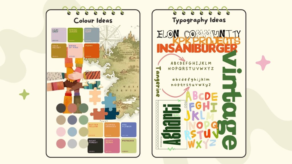
At this stage, I had multiple ideas ruminating so it was difficult to narrow down my mood boards. Instead, I chose to leave the door open to multiple possibilities, and included several concepts, from hands together to local maps. I found that visuals also helped express the implications of my colours. Much like the illustrations demonstrated to us by Gill and Kate, I felt it was important to stray away from more common ‘community project’ designs. By using rich greens, oranges and blues, I hope to encapsulate a grown up concept of youthfulness.
However, this is great until you factor in colour-blindness. After reading about the different versions of vision deficiency (N.E. Institute, 2025). I learnt that green, orange and red and some of the hardest colours to perceive. To combat this, I aim to look at how to adjust designs to aid this affliction in my next stage of development. By using different pieces of software, I hope to be able to add a feature that with assist this.
Moving on to Typography. In order to compliment my colour palette, as I previously stated I chose to focus primarily on sans-serif font. Whilst this is a personal bias, I also looked into the psychological implications. I found that most organisations who use sans-serif fonts tend to be perceived to embody cleanliness and clarity (G. Svaiko, 2013). Users found that the agendas appeared modern and efficient (G. Svaiko, 2013). This is exactly the kind of branding I wanted display. So, I gathered up a collection of fonts I feel are still in keeping with my very rough brand guidelines. Whether I implement these exact fonts into my final website and logo designs is entirely dependant on how the project unravels. I do, however, know that it’ll be sans-serif all the way.
Logos & Initial Concepts
Thanks to my extensive research into what components were needed for my website, it was finally time to start implementing them into my designs.
I started with logos, as this felt like a logical point to start establishing who ‘The Participatory Collective’ was as a brand. But where to start? Well, I turned to my peers for feedback and with their help, constructed a list of words we felt expressed the organisation. Whilst words like friendship, trust and family were thrown around, two key words spoke to me instantaneously. Connect and Community. From here I decided to dedicate my branding towards one simple phrase “Connect with your Community”. This quickly became my slogan and helped inspire each logo design. However, in order for my slogan to flow naturally in my designs, I needed them to each tell a story.
Overall, I ended up designing four contrasting concepts. These where rough sketched out designs, with makeshift text and even more impromptu colours. Of the four, three fell under the theme of connectiveness, with my final logo demonstrating more the individual voices. Ironically, individuality persevered, as this ended up being my favourite design. Though there was nothing wrong with the other logos, I had issues with each of them. The entangled hands, whilst telling a story of connecting thoughts, looked complicated and difficult to decipher. The handshake wasn’t bad but just didn’t purvey the correct message. Then there was the jigsaw pieces, with my biggest problem being the legibility of the name. Ultimately this led me to my strongest contender, the speech bubbles. I felt this was a unique way of using colour to express multiple voices joined together, and with the correct font could become more a stand out piece.
Before moving into my website concepts, I felt it best to also take into consideration the environmental impact of my designs. Whilst most would associate this portion of research to be primarily about dark-mode accessibility, that is just one small feature in improving my sites carbon footprint. When researching what things to consider when designing a website, I quickly learnt that simple is best. Using smaller images, removing videos, having less content and avoiding multiple fonts (F. Sirman, 2024) was the way to go. However, on a website with sixteen different communities, that was going to be hard to achieve. Instead, I focused on the tier system that this blog implements (F. Sirman, 2024) and aimed for a very healthy silver bracket. This allowed me to not sacrifice my brands identity and individually for the sake of eco-friendliness. This mostly entailed supplementing pictures for fonts thus reducing the amount of energy required to load my sites pages. Much like my research into colour-blindness, I do also aim to include a dark-mode features for my users to also help assist in this mission as well.
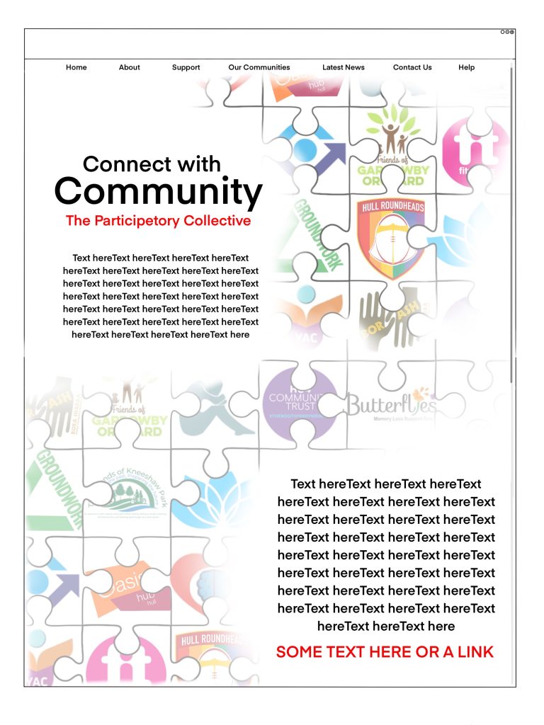
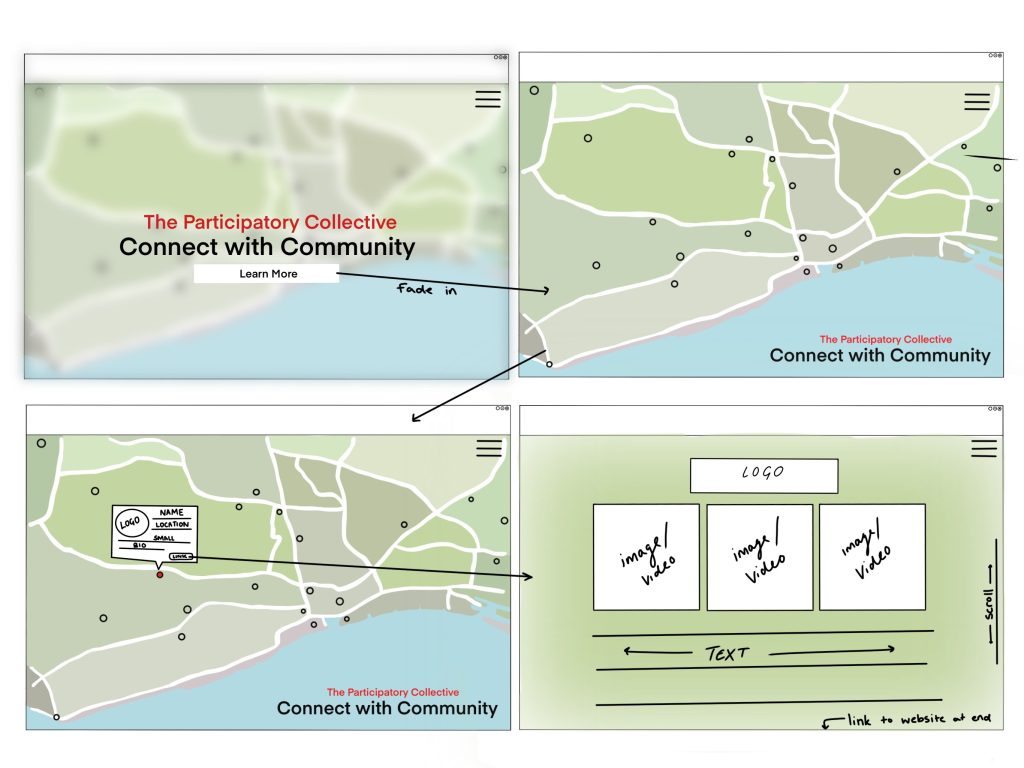
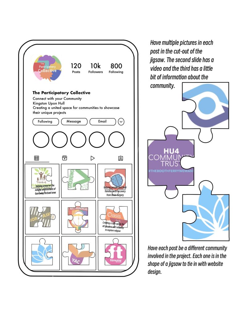
With all of this information to help guide me, I started designing my website concepts. Similar to my logos, I felt multiple iterations was the best way to go, resulting in three proposals. Two of these designs grew from one another, with large themes of jigsaws to help display pieces connecting. The first, was an elaborate page showing all sixteen groups as puzzle piece. My main concept for this piece, was to make the site as interactive as possible. This would be achieved through small videos of each community playing when the user hovered over the logos, which could then be clicked on to explore the individual projects further. The second was a much more simplified construct of this. Whereas the previous design was aimed to be interactive, this format was much more text oriented. Whilst I liked the striking nature of this design, the eco-footprint was too large, as each image required excess energy to display. The final was very opposed to the previous two, with the main concept being a map of Kingston Upon Hull. The idea was to create a real sized map showing each communities location in Hull. Whilst this concept was my great in theory, I found that the communities were too spread out. If I’d have moved forward with the design the text size would have been greatly diminished, impacting a large percentage of my target audience.
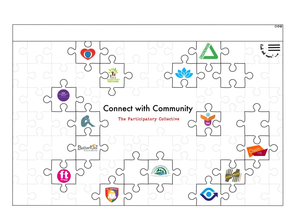
All of these concepts were later then shown to my peers and tutor for feedback. Whilst most enjoyed all three of my designs, from an accessibility and interactivity stand point it was clear which design I aim to move forward with. Settling on my first jigsaw concept.
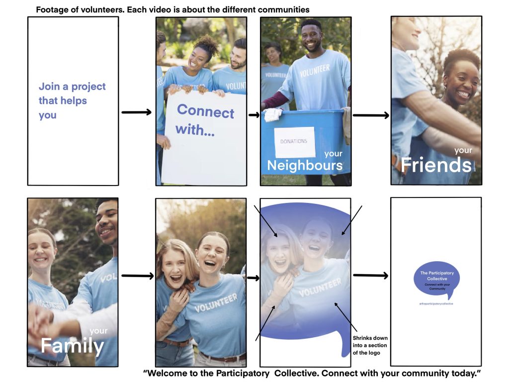
Now to wrap up this stage of my project, I must admit I also chose to dabble into some social media and marketing campaign concepts. Despite this being something I aim to look at further down the line, I felt now was a great time to explore some hypothetical marketing decisions. Don’t worry, I didn’t dive too deep. Creating a rough mock-up of a social media page, alongside a video storyboard, gave me a rough idea of how some of my concepts would work together as a brand. Whilst not essential, I do feel as though this gave me a better understanding of how my colours, typography and (most importantly) message, will be shown and received by my users.
Ultimately, this all leads towards making each of my stakeholders happy. For the community organisations, I’ve factored in the need for separate pages per group, alongside giving them all appropriate visibility and brand recognition. For my academics and researchers, I’ve created a detailed mood boards showcasing each community, whilst also taking an extra step by interviewing the participants separately. I’ve also shown clear storytelling potential for my brand, opening the door to collaborations with communities in the future, which also benefits my funders. All of this contributing to benefit my policymakers and local authorities. A stand out for this, being through the use of maps in my designs, helping to demonstrate where their policies are having an impact.
References
Writing
- Quote Sarah Dew (2023) Change Happens at the speed of trust – Health Innovation Yorkshire. https://www.healthinnovationyh.org.uk/blog/change-happens-at-the-speed-of-trust/ [Accessed 21 Oct 2025]
- National Eye Institute (2025) Types of Color Vision Deficiency | National Eye Institute. https://www.nei.nih.gov/learn-about-eye-health/eye-conditions-and-diseases/color-blindness/types-color-vision-deficiency [Accessed 21 Oct 2025]
- Gert Svaiko (2013) Font Psychology: Here’s Everything You Need to Know About Fonts. https://designmodo.com/font-psychology/ [Accessed 21 Oct 2025]
- Fred Sirman (2024) Something Familiar | Blog: Demystifying sustainable website design: how we make eco-friendly considerations for our websites. https://somethingfamiliar.co.uk/sustainable-website-design/ [Accessed 21 Oct 2025]
Client Research
- OSHI (2024) OSHI – The Open Source Healing Initiative in Hull UK. https://www.oshi.org.uk/ [Accessed 21 Oct 2025]
- Butterflies (2025) Butterflies – Memory Loss Support Group. https://www.butterflies.org.uk/ [Accessed 21 Oct 2025]
- Open Collective (2025) Hull Prison Abolition Group (aka OUT) – Open Collective. https://opencollective.com/out [Accessed 21 Oct 2025]
- The Ideas Fund (2025) The Ideas Fund | OUT – Open Up and transform. https://theideasfund.org/grants-stories/out-open-up-and-transform [Accessed 21 Oct 2025]
- Youth Aspire Connect (2025) YAC. https://youthaspireconnect.org.uk/ [Accessed 21 Oct 2025]
- P.A.U.L For Brain Recovery (2025) Home – P.A.U.L For Brain Recovery. https://paulforbrainrecovery.co.uk/ [Accessed 21 Oct 2025]
- ERNI Movement (2025) Emotions Are Not Illnesses | ERNI Movement | Mental Health. https://www.ernimovement.com/ [Accessed 21 Oct 2025]
- Hull Roundheads (2025) HULL ROUNDHEADS. https://www.hullroundheads.com/home [Accessed 21 Oct 2025]
- Sight Support Hull & East Yorkshire (2025) Home – Sight Support. https://www.sightsupport.org/ [Accessed 21 Oct 2025]
- The Ideas Fund (2025) The Ideas Fund | Voice speak Up. https://theideasfund.org/grants-stories/voice-speak-up [Accessed 21 Oct 2025]
- Groundwork UK (2025) Yorkshire – Groundwork. https://www.groundwork.org.uk/yorkshire/ [Accessed 21 Oct 2025]
- HU4 Community Trust (2019) HU4 Community Trust. https://www.hu4communitytrust.co.uk/ [Accessed 21 Oct 2025]
- Oasis Hub Hull (2025) Oasis Hub Hull. https://oasishull.org/ [Accessed 21 Oct 2025]
- Fitmums & Friends (2025) Together in Grief – The Forest Project: Fitmums & Friends. https://fitmums.org.uk/support/together-in-grief-the-forest-project [Accessed 21 Oct 2025]
- Friends of Garrowby Orchard Community (2018) Facebook. (https://www.facebook.com/profile.php?id=100071402726994# [Accessed 21 Oct 2025]
- Garrowby Orchard (2023) WhoseSpace? Derringham – YouTube. https://www.youtube.com/watch?v=o2Dmneq36Ow [Accessed 21 Oct 2025]
- Professor Andy Jonas (2021) Alderman Kneeshaw Park: the replenishment of a neglected urban public space. https://hull-repository.worktribe.com/project/3768985/alderman-kneeshaw-park-the-replenishment-of-a-neglected-urban-public-space [Accessed 21 Oct 2025]
- The Friends of Alderman Kneeshaw Park (2015) Facebook. https://www.facebook.com/FriendsofKneeshaw/?locale=en_GB [Accessed 21 Oct 2025]
- Bora Shabaa (2025) Bora Shabaa Community Refugee Organisation | Helping immigrants. https://borashabaa.org.uk/ [Accessed 21 Oct 2025]
- The Idea Fund (2015) the Ideas Fund | Projects. https://theideasfund.org/projects/projects/p5?area%5B%5D=5664 [Accessed 21 Oct 2025]
Competitor Research
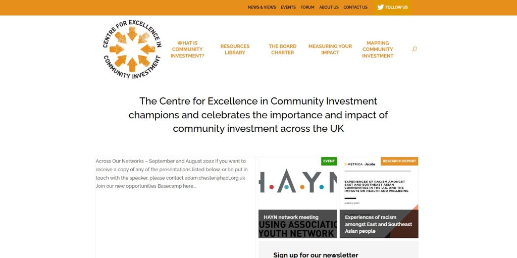
- CECI (2022) CECI | The Centre for Excellence in Community Investment. https://ceci.org.uk/ [Accessed 21 Oct 2025]
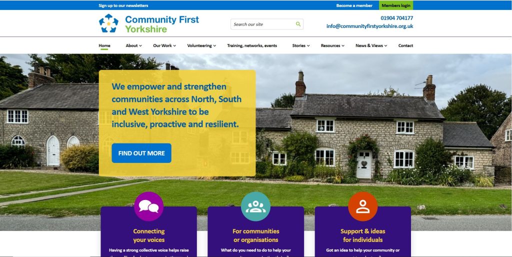
- Community First Yorkshire (2025) Rural And Voluntary Organisations – Community First Yorkshire. https://www.communityfirstyorkshire.org.uk/ [Accessed 21 Oct 2025]
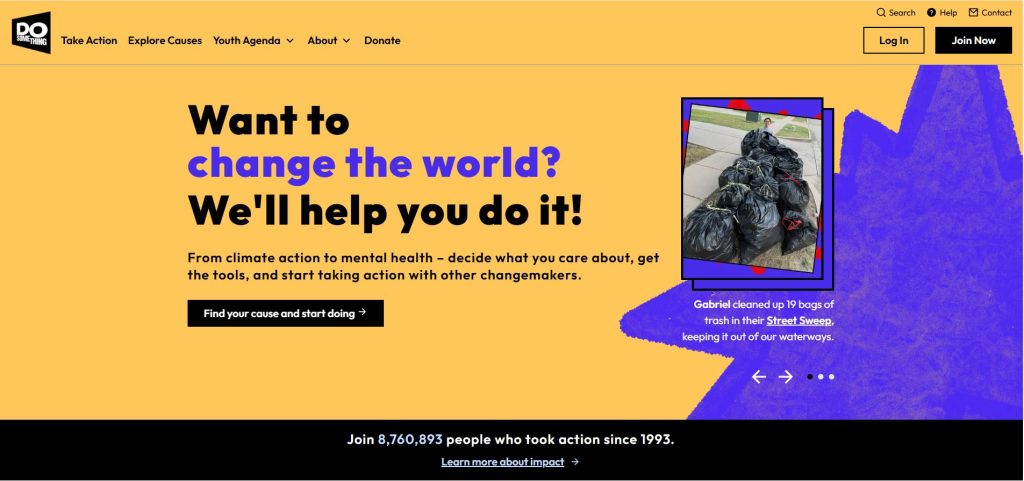
- Do Something (2025) Fueling Young People to Change the World | DoSomething.org. https://dosomething.org/ [Accessed 21 Oct 2025]
- Volunteering Matters (2025) Creating stronger communities from within. https://volunteeringmatters.org.uk/ [Accessed 21 Oct 2025]
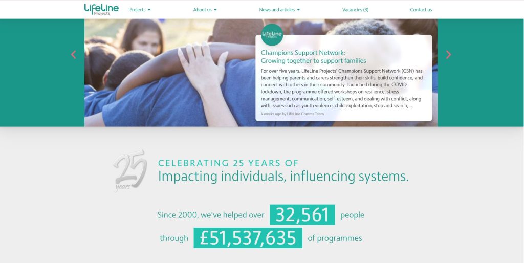
- LifeLine Projects (2025) LifeLine Projects – impacting individuals, influencing systems. https://www.lifelineprojects.co.uk/ [Accessed 21 Oct 2025]
- Emily Stevens (2024) What are the laws of UX? All 21 laws explained. https://www.uxdesigninstitute.com/blog/laws-of-ux/ [Accessed 21 Oct 2025]
Images
- Jacob Lund (2025) Beautiful Senior woman at Coffee Shop – Photos by Canva. https://www.canva.com/photos/MADBdvKq9vg/ [Accessed 21 Oct 2025]
- mikanaka (2025) Disabled Friends – Photos by Canva. https://www.canva.com/photos/MADAT1IEzKg/ [Accessed 21 Oct 2025]
- West End Girl Studio (2024) 2024 COLORS – Kirsten Kizerian – West End Girl. https://www.westendgirlblog.com/2024-colors/ [Accessed 21 Oct 2025]
- bloomsociety (2025) Retro Color Palette for Creatives – 15 Bold & Playful Hex Codes. https://uk.pinterest.com/pin/1970393583686223/ [Accessed 21 Oct 2025]
- Wanda Goforth (2025) Mute Color at Wandagoforth. https://uk.pinterest.com/pin/923519467363857461/ [Accessed 21 Oct 2025]
- Sophrosyne (2025) Pin on KaPTbI. https://uk.pinterest.com/pin/5770305768599180/ [Accessed 21 Oct 2025]
- rawpixel (2025) Download premium vector of Puzzle pieces clipart, business problem solving vector about puzzle, problem solving, gognitive, illustration, and jigsaw 5805447. https://uk.pinterest.com/pin/6122149487910938/ [Accessed 21 Oct 2025]
- YourRadiantSoul (2025) Pin on psicologa. https://uk.pinterest.com/pin/1548181186181557/ [Accessed 21 Oct 2025]
- Prostock-Studio (2019) Meeting Of young Volunteers Team In Park Stock Photo – Download Image. https://www.istockphoto.com/photo/meeting-of-young-volunteers-team-in-park-gm1145183120-308162000 [Accessed 21 Oct 2025]
- PeopleImages (2024) Happy Volunteer Portrait People Park Charity Stock Photo 2507688333. https://www.shutterstock.com/image-photo/happy-volunteer-portrait-people-park-charity-2507688333 [Accessed 21 Oct 2025]
- PeopleImages (2024) Park volunteer and hands of friends in circle together for solidarity in sustainable green project collaboration goals and people in huddle for teamwork community care and social responsibility. https://www.freepik.com/premium-photo/park-volunteer-hands-friends-circle-together-solidarity-sustainable-green-project-collaboration-goals-people-huddle-teamwork-community-care-social-responsibility_377514475.htm [Accessed 21 Oct 2025]
- Wavebreak Media (2025) Mixed race couple spending time outside with their family, presenting a donations box with clothes in it, looking at the camera and smiling, all wearing blue volunteers t shirts, on a sunny day. https://www.freepik.com/premium-photo/mixed-race-couple-spending-time-outside-with-their-family-presenting-donations-box-with-clothes-it-looking-camera-smiling-all-wearing-blue-volunteers-t-shirts-sunny-day_58618633.htm [Accessed 21 Oct 2025]
- Wavebreakmedia_micro (2025) Group of volunteer holding blank sheet | Premium Photo. https://www.freepik.com/premium-photo/group-volunteer-holding-blank-sheet_6780622.htm [Accessed 21 Oct 2025]
Fonts
- Gina Apperson (2012) Elon Community Font | dafont.com. https://www.dafont.com/eloncommunity.font [Accessed 21 Oct 2025]
- Farid Rahman (2020) Kpk Project Font | dafont.com. https://www.dafont.com/kpk-project.font [Accessed 21 Oct 2025]
- Insanitype (2005) Insaniburger Font | dafont.com https://www.dafont.com/insaniburger.font [Accessed 21 Oct 2025]
- Flavia Bocco (2007) Vintage Font | dafont.com https://www.dafont.com/vintage.font [Accessed 21 Oct 2025]
- Best Handwritten Fonts Free (2025) Font Inspiration: 10 Uniques Fonts for Your Next Project. https://uk.pinterest.com/pin/29906785021172184/ [Accessed 21 Oct 2025]
- Paloma Alejandra (2025) colourful alphabet. https://uk.pinterest.com/pin/844493675009875/ [Accessed 21 Oct 2025]
- Siteoutside (2025) Agharti – Bold Display Font – Siteoutside. https://uk.pinterest.com/pin/108156828547466614/ [Accessed 21 Oct 2025]