My Project/ Recap
Welcome back and say hello to part two of my project with ‘The Participatory Collective’. For those who are new here, I felt it appropriate to start with an initial recap of my project so far.
So where did we begin… Well, my first steps were heavily dedicated to research! So, what is ‘The Participatory Collective’, well to quote myself “The PC is a privately funded organisation by ‘The Ideas Fund’ (Ideas Fund, 2025), designed to give the vast communities of Kingston Upon Hull a voice” (R. Powls, 2025). With sixteen unique communities being represented by this organisation, I felt it was crucial to establish a clear, in-depth understanding of each of them before progressing forward. In order to really achieve this, I conducted four separate interviews, resulting in exclusive knowledge and additional content from some of the groups. From here, I had established a solid base of information to expand on when researching my competitors and creating mock users.
Once all research had been gathered, and my user age bracket had been established, I chose to shift my attention onto which design laws I wanted to instil. Whilst still following classics such as ‘Jakob’s’ and ‘Fitts’s’, my main three goals were ‘Law of Proximity’, ‘Law of Uniform Connectedness’ and the ‘Law of Similarity’ (E. Stevens, 2024). All crucial laws to consider when moving forward in my project.
Next became the design stage, and I’ll be brief. Using all my previous research and the addition of mood boards, I created four mock-up logos and three website concepts. Each had pros and cons, that I’ve previously discussed but after peer feedback, I was able to establish one of each to develop into this stage of my project.
So now that we’re all caught up, I’d like to present to you ‘Project Two’…
Call-to-Action
My initial focus in this stage of the project, was dedicated to perhaps the most valuable piece of information I could have before moving forward, my call-to-action. Before even daring to touch Figma, my call-to-action was essential. As I’ve previously stated, my last stage of the project was heavily devoted to research. Whilst this was important at the time, it has become even more crucial now, becoming a key ingredient in the creation of my CTA. Without the extensive research into my competitors and design laws, I would have been unable to establish what I would describe as ‘key pillars’ in my CTA.
When creating my call-to-action, I wanted to focus on the five main goals I wanted my user to achieve when navigating my site. Summarized into five simple words, this became: Finding, Learning, Deciding, Connecting and Supporting. The first being ‘Finding’. This, as you can imagine, was all about how my user would find ‘The Participatory Collective’. Be it through search engines or social media, I wanted to path out my users journey from beginning to end. Next, was ‘Learning’, arguably the most vital of the five, as this is where I aim to establish all the key information about ‘The PC’ with my users. Using the suggested headers of ‘Our Story’ and ‘Our Vision’, brought forward by Gill and Kate, I want my users to peruse these two pages in order to answer any questions they may have about ‘The Participatory Collective’. The next two ‘Deciding’ and ‘Connecting’ were all about the individual community pages and how my users find, decide and interact with them. Whilst I know this project is heavily aimed towards the needs of ‘The Participatory Collective’, from an ethical stand point, the communities should be equally as important, as ultimately you can’t have one without the other. This resulted in segments dedicated to each step, from the community page, to information, to making contact, all the way to participating in an event. Thus, segueing into my final pillar, ‘Supporting’. Despite being a smaller segment in my call-to-action, I felt it crucial to also focus on how my user plans to interact with my site over a long-term timeline. By establishing a sign in/ sign up feature, it adds a need for the user to re-engage with the site in the future. This paired with the addition of social media, allows the user to check-in and stay updated on the organisation more frequently (and on the go).
Thanks to these five key pillars, I can establish a clearer outline of what I want to achieve moving forward with my site, and how it will serve to benefit ‘The Participatory Collective’.
Development & Feedback
After firmly establishing my call-to-action, it was time to start working on my initial sketches of what I wanted my website to become. Unlike my past tasks, this became less about iterations and more about development.
“Design is the silent ambassador of your brand” (P. Rand, 1985) is something I definitely wanted to ruminate on whilst navigating my wireframe mock-ups. Whilst colour, typography and layout were all vital, I didn’t want to lose the story-telling potential of my websites branding as well. One of the first ways I set about ensuring this wouldn’t happen, was through a consistent theme I had established early on in my project. With the addition of jigsaw pieces scattered throughout my design and used to house not only visuals but key information, I was able to create a narrative of ‘connectivity’ within my site.
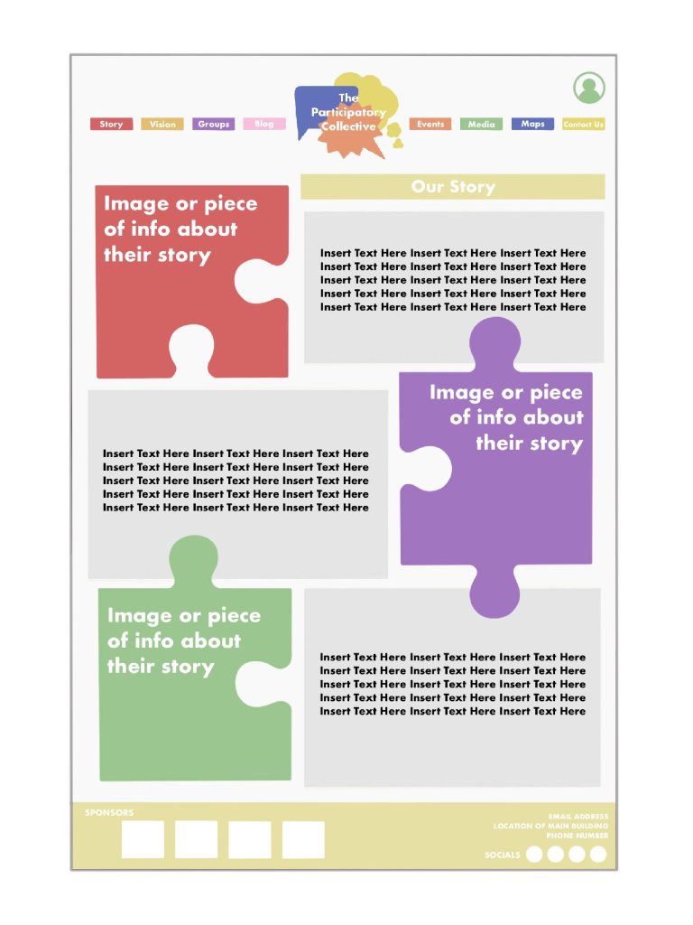
To assist in showcasing my vision, I ended up designing two potential pages that I could later develop into my working mid-fidelity prototype. Since I already had a clear vision of my home page, I chose to instead look at my ‘Our Story’ and ‘Podcasts’ pages. A logical first step became ensuring I was using the correct design laws when mapping out my pages compositions. This meant ‘Jakob’s Law’ (E. Stevens, 2024) was in full swing. Starting each page with a menu bar along the top, I then added a simplified rendition of my logo as a central focal point. Both paired with a sign in/ account feature in the top right and a footer displaying ‘The PC’s’ sponsors along the bottom.
With a clear base that I could use throughout each of my pages, I started creating my users content. For my ‘Our Story’ page, this translated into following my vague brand guidelines and implementing jigsaw pieces as staples for key images and text. From here, I then chose to block out sections devoted to text, as I felt this was a crucial page for information. Overall, I liked the striking nature of the design and felt it was in-keeping with my original vision at the time, I have since changed my opinion. This was partially due to peer feedback. As when shown this development, many stated that the layout whilst clean, didn’t align with the overall identity of the collective. I ended up agreeing, as I feel this lacks the story-telling potential I so desperately wish to display.
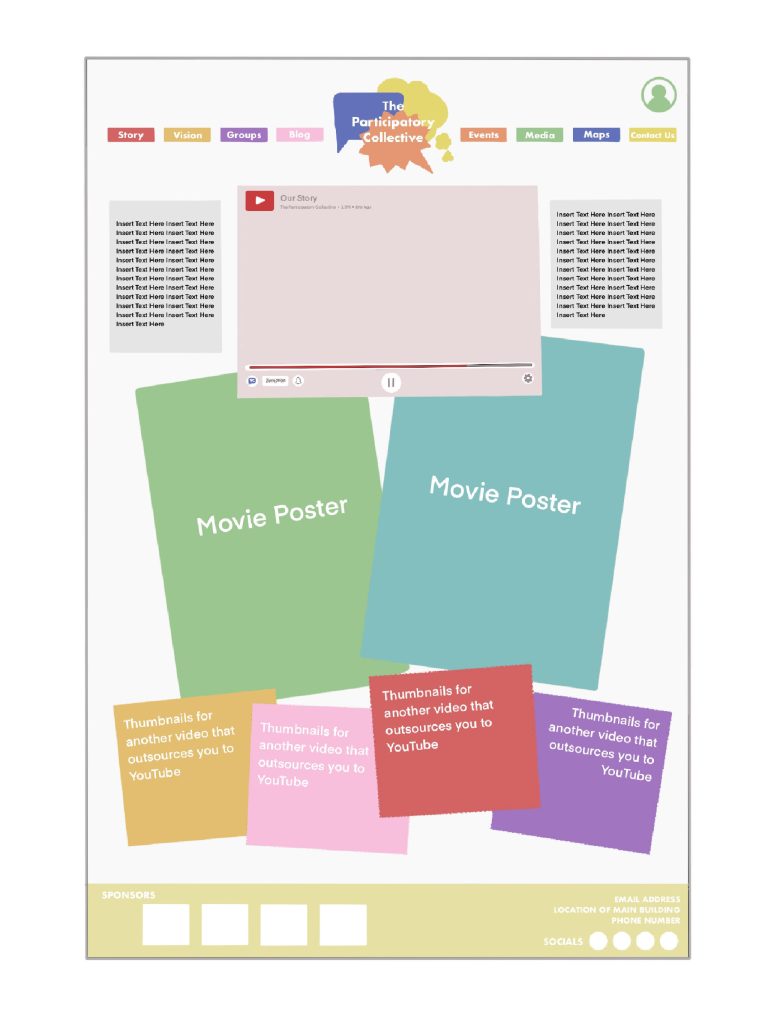
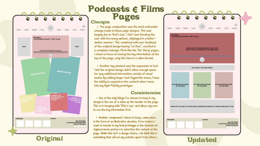
My second and final development, was my ‘Podcasts & Films’ page. As per the previous, having a solid base that followed ‘Jakob’s Law’ (E. Stevens, 2024) allowed me to move straight into my compositional layout. Given as this page would result in being very media heavy, I wanted to challenge the more ‘traditional’ approach by flirting with the ‘Aesthetic-Usability Effect’ (E. Stevens, 2024). This meant bold statement images, a video at the forefront and what I would deem a helter skelter effect on any and all boxes of text/ media. Much like the other, I also offered this design up as a sacrifice to my peers. Unlike my previous tribute, this development was received with large positivity, with a majority stating that it was a fresh take on the communities values. However, hindsight is devilish mistress, and I shortly realised that all of my peer feedback came from users between the ages of eighteen and twenty-one, not ideal given my user age bracket. With this in mind, I think I may need to tweak the placement and angling of this page when I move into my Figma design.
Mid-Fidelity Prototype
With peer feedback and a flushed out call-to-action strapped to my belt, I was ready to finally start building the mid-fidelity prototype of my website.
Mirroring my development designs, I started once again with ‘Jakob’s law’ (E. Stevens, 2024) and chose to recreate the menu, logo and sign in bar along the top of my page. I also felt this was an appropriate time to add the footer, as these were key features I wanted to display on every page apart from my home. Now I once again had a clear base I could use as a template for all twenty eight pages.
When it came to adding the compositional layouts to each of my websites frames, I wanted to use snippets of information and feedback I’d already gathered throughout my project. The biggest of this, coming from ‘The Participatory Collective’ themselves. In a presentation given to us by Gill and Kate, they demonstrated numerous visuals they felt were a good starting point for ‘The PC’s’ values. One of the key design choices I made, was inspired heavily by this. After the extremely negative feedback on my designs for the ‘Our Story’ page, I felt this was an excellent opportunity to shape my design more towards the vision of the collective, without sacrificing my storytelling. This is something I go into more in my annotations but to summarize, it resulted in a complete redesign with only a few jigsaw pieces remaining unscathed.
Another crucial piece of information I wanted to carry with me into my designs was the ‘Peak-End Rule’ (E. Stevens, 2024). When researching my competitors in my previous project, I found early on that when it came to design laws, many followed the same set of rules. Don’t get me wrong, there is a vital place for both ‘Jakob’s’ and ‘Fitts’s’ (E. Stevens, 2024), but I knew from the start that in order to make my site stand out, I needed to be more adventurous. So, whilst still treading the line of my users age bracket, I felt the ‘Peak-End Rule’ was a perfect middle ground. The main way I implemented this law was by addressing which pages would be the ‘peak’ of my users experience. Thanks to my call-to-action, I deduced that my home page, story and vision pages were likely to be my most interacted with frames. This helped inspire the ‘Our Story’ redesign but also aided in the use of a scroll feature in the ‘Our Vision’ segment. By using speech bubbles, I was able to display ‘The Participatory Collective’ goals. Much like the logo, this was designed to help demonstrate the multiple voices of different communities, coming together to share clear and consistent visions for the future.
The final vital piece of feedback I used to fuel my designs, was through the addition of a map page. Whilst this is not something ‘The Participatory Collective’ originally pushed for, feedback from both my tutor and stakeholders suggested this addition would be valuable towards my users experience. By allowing my users to visualize the communal reach of ‘The PC’, they were able to associate familiar areas with certain communities. This also paired well with my users physical accessibility, as they were able to navigate which groups were closer to them geographically. Due to the positive impact of this design choice, I also felt it would be useful to include this feature through other relevant pages. With the addition of a small more concentrated version of the map on pages such as the ‘contact us’ and individual ‘event’ pages, I was able to stretch the narrative of ‘The Participatory Collective’ more. Resulting in showcases of more localised areas that expanded on the ‘connectiveness’ theme.
Ultimately the rest of my mid-fidelity prototype unfolded naturally, with basic features all but designing themselves. The only other minor element I chose to add was the addition of overlays. When testing my designs usability, I discovered that I’d massively overlooked the pathways between each community page. So, in order to increase both my usability and accessibility, I chose to add a drop down menu overlay that would allow the user to navigate between each section. Whilst this is not coded to it’s full potential, thanks largely to Figma’s limitations, it’s definitely a feature I want to expand on in my final prototype. This could even mean adding similar drop downs for pages such my ‘Events’ and ‘Blogs’ in the future.
Annotations
Despite wrapping up my mid-fidelity, it’s worth noting that I also annotated alongside my design, in order to help log key changes and choices. Whilst I’ve already spoken about some of these decisions, I chose to elaborate on what I would deem are the four major points in my project.
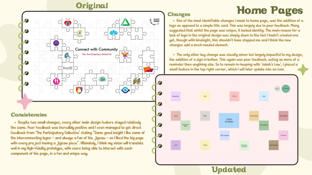
Jumping straight in with my ‘Home Page’. One of the most identifiable changes I made was through the addition of a logo. When compared with my original mock-up, one thing that really called out was the lack of identity. This was solidified even more when brought in front of my peers. This was a simple fix, by merely substituting the title card for my pre-designed logo. Ultimately unifying my concept and translating a much clearer brand for my user. This is even more crucial when you take into consideration the ‘Serial Position Effect’ (E. Stevens, 2024) as this is the first page my users will interact with. Overall, this ended up being one of the only changes I made to this page, as most of my design stayed relatively the same. A massive contributor for this, was feedback from ‘The Participatory Collective’ themselves, as they stated they are “Always a fan of jigsaws.”.
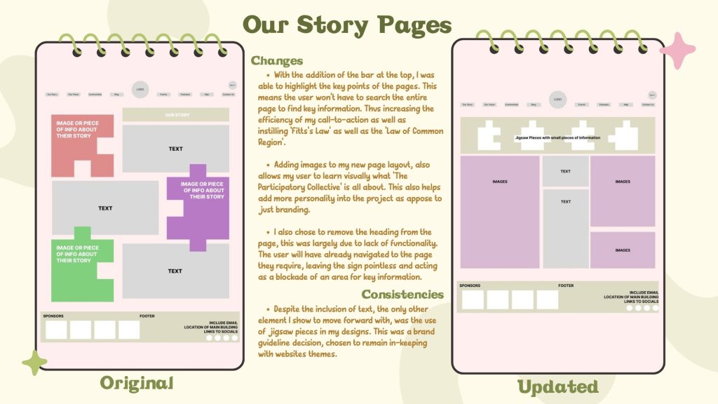
Next on the chopping board, is yet again the ‘Our Story’ page. Now I’ve already discussed some of the changes I made to this page and why, but I wanted to expand on it just a little bit more. The most notable being the information bar at the top. Whilst this is (as I previously stated) inspired by the presentation by Gill and Kate, I also used this as a great opportunity to improve the efficiency of my call-to-action. By instilling both ‘Fitts’s Law’ and the ‘Law of Common Region’ (E. Steven, 2024), I was able to prioritize key information at the top of the page. Thus, allowing my users to reach my CTA’s desired goals much quicker than before. From here, this then rendered my previous header all but useless, resulting in its removal. Whilst the new page layout works more efficiently with both my storytelling and brand guidelines, I’m worried about the sustainability of my design. Moving forward in my project, I will need to remain conscious of this, making sure to cap media file sizes and reduce the number of fonts used throughout my design.
With sustainability still at the forefront of my mind, I felt this was a great time to finally tackle the redesign of my ‘Podcasts & Films’ page. As I previously discussed, peer feedback had left me very conflicted when it came to this original concept. Despite the positive feedback, I couldn’t help but feel as though this concept went against both my usability and sustainability goals. With a page heavily dedicated to mixed media, it was hard to figure out how to navigate my carbon footprint. I felt the best way to tackle both of my growing concerns was with less of redesign and more of a reshaping. This started by eliminating the helter skelter effect my peers were so fond of and substituting a clean straight layout in it’s place. One fear conquered. Next was the overload of images. As I previously stated in my last blog, I didn’t want to sacrifice my brands identity and individually for the sake of eco-friendliness. However, I was still aiming for that silver bracket of awareness (F. Sirman, 2024). This meant reducing the number of images I was willing to throw at this page. Instead of six loud pictures slowly sucking the life out of the planet, I reduced it to three, halving my harmfulness. Overall, this allowed for more space for text and hyperlinks, outsourcing the media to other sites, as opposed to increasing the footprint of my own.
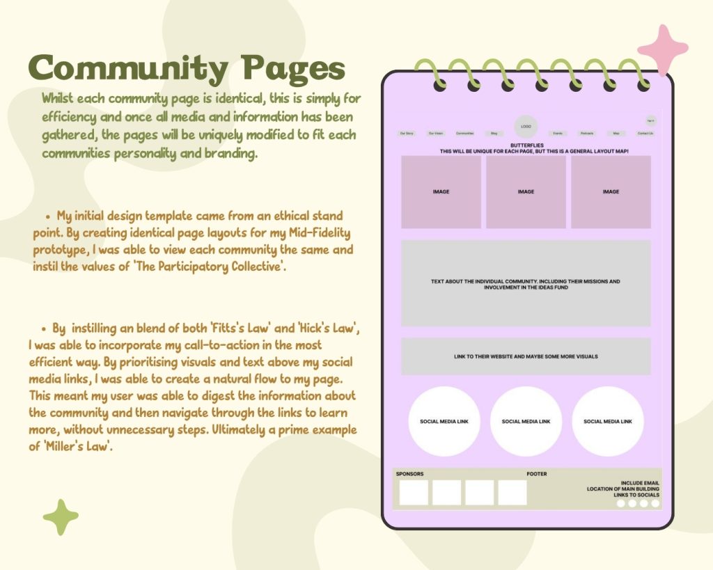
The final brief annotation I felt crucial enough to include, was my ‘Community’ page. Compared to the others, this one stands apart for one simple reason, it has no development. Whilst the other three highlight changes already made, this showcases what will be changed. When creating my mid-fidelity prototype, I felt it was important to all my stakeholders to demonstrate the ethical impact of the pages having the same level of commitment. Despite these pages being expanded on in the future to allow more individuality and personality to shine through, they will all stay within this original template.
Moving forward, into my final stage of this project, I only aim to improve. Whilst I’m happy with the changes I’ve made, I feel many of my design features will become more impactful in my final rendition. One large component I still aim to tackle is a colour-blind and dark mode feature. This became heavily skipped over at this stage of the project, due in large to my technical limitations. I aim to use Elementor in the future, to finally start implementing these modes into my site. Overall, I think my mid-fidelity prototype showcases my vision for ‘The Participatory Collective’ and how I aim to expand on their vision in the finished product.
References
In text
- Paul Rand (1985) “Design is the Silent Ambassador of your Brand”. What did Paul Rand mean?. https://designedbyten.com/design-is-the-silent-ambassador-of-your-brand-what-did-paul-rand-mean [Accessed 22 Nov 2025]
- The Idea Fund (2015) the Ideas Fund | Projects. https://theideasfund.org/projects/projects/p5?area%5B%5D=5664 [Accessed 22 Nov 2025]
- Emily Stevens (2024) What are the laws of UX? All 21 laws explained. https://www.uxdesigninstitute.com/blog/laws-of-ux/ [Accessed 22 Nov 2025]
- Ronnie Powls (2025) Research & Design Proposal Blog – Ronnie Powls. https://powls-2024.hulldesign.co.uk/2025/10/21/research-design-proposal-blog/ [Accessed 22 Nov 2025]
- Fred Sirman (2024) Something Familiar | Blog: Demystifying sustainable website design: how we make eco-friendly considerations for our websites. https://somethingfamiliar.co.uk/sustainable-website-design/ [Accessed 22 Nov 2025]
Photos in Figma file
- Canva (2025) canva-simple, – universal – calendar – template – ZhEQgFtZ37U.jpg (1600 x 900). https://marketplace.canva.com/EAE4sCFaVK4/1/0/1600w/canva-simple%2C-universal-calendar-template-ZhEQgFtZ37U.jpg [Accessed 22 Nov 2025]