After finally deciding which logo I wanted to use for my brands identity, it was time to start focusing on the layout and functionality of the app itself. What good is a brand without a functional product?
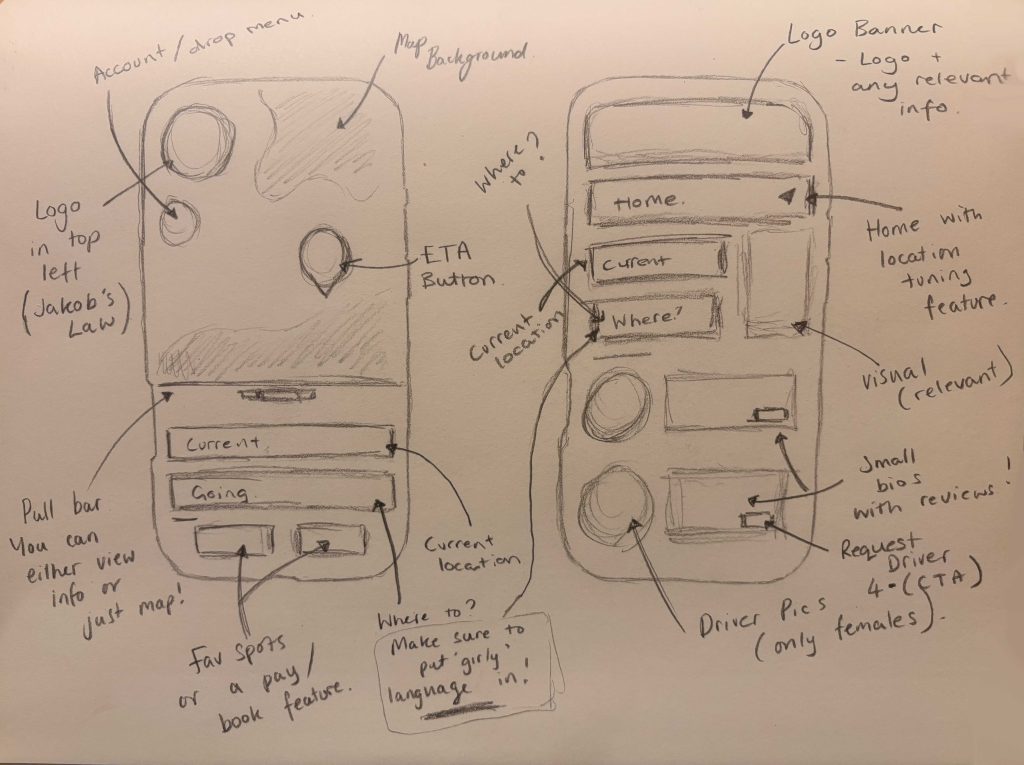
The first step towards this, was through quick pencil wireframes, which I then developed into digital renditions for clarity. By creating these four rough wireframe sketches, I was able to start deciding which key design laws I wanted to focus on throughout my app. Looking back at my competitors, I noticed that almost every app instilled a mixture of ‘Jakob’s Law’, ‘Laws of Similarity’ and the ‘Aesthetic-Usability Effect’ (E. Stevens, 2024). So, that’s were I started. This meant, for most, a map on the top, information underneath and a pay/book feature along the bottom. Whilst these were tried and tested methods for most taxi apps, I wanted to shift my attention onto different designs laws, to help my brand stand out.
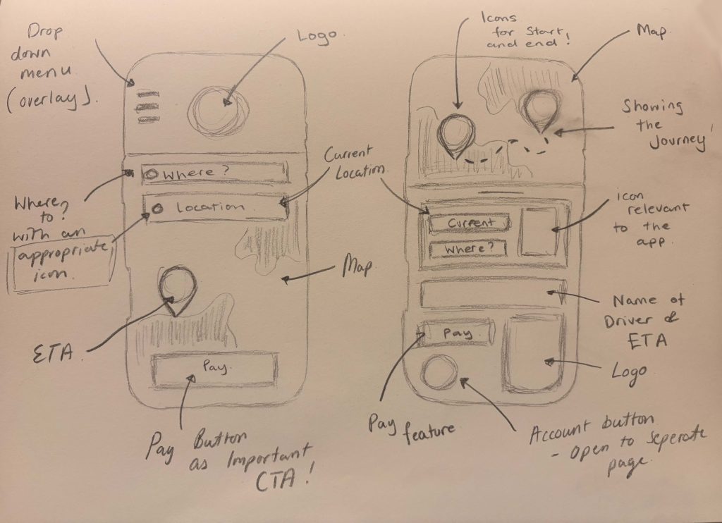
When moving into Figma (Figma, 2025) it was the two compositions that strayed from my competitors the most, that I chose to develop. The first of my two choices, focused more predominantly on ‘Hick’s Law’ (E. Stevens, 2024) above anything else. Given as a huge section of my user demographic is middle-aged, I wanted to streamline their choices as much as possible. This meant eliminating any and all unnecessary information. By simply focusing on the journey, payment and time, the user was able to achieve their goals much quicker, which also became a great way of instilling ‘Miller’s Law’ (E. Stevens, 2024). As not to completely ignore laws such as ‘Jakob’s Law’ (E. Stevens, 2024), I did also decide to add a menu overlay into my prototype. Despite not being a functional app, I still wanted to show the extra additional feature my users could access on the home page.
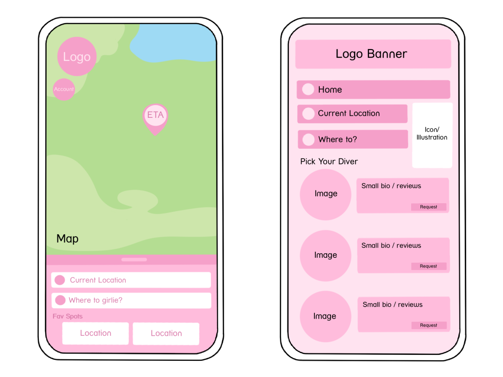
Shifting my attention onto my second app composition, I chose to focus on the opposite side of my previous laws. This meant getting up close and personal with ‘Parkinson’s Law’ (E. Stevens, 2024). Whereas my previous design was ultimately streamlined to focus on my call-to-action, this layout was maximized for information. By adding a section dedicated to the biographies and ratings of my companies drivers, I was able to focus on the safety elements discussed in my brands personality. Whilst these features were in keeping with my brands storytelling, I felt the visual hierarchy of this layout didn’t align with my call-to-action.
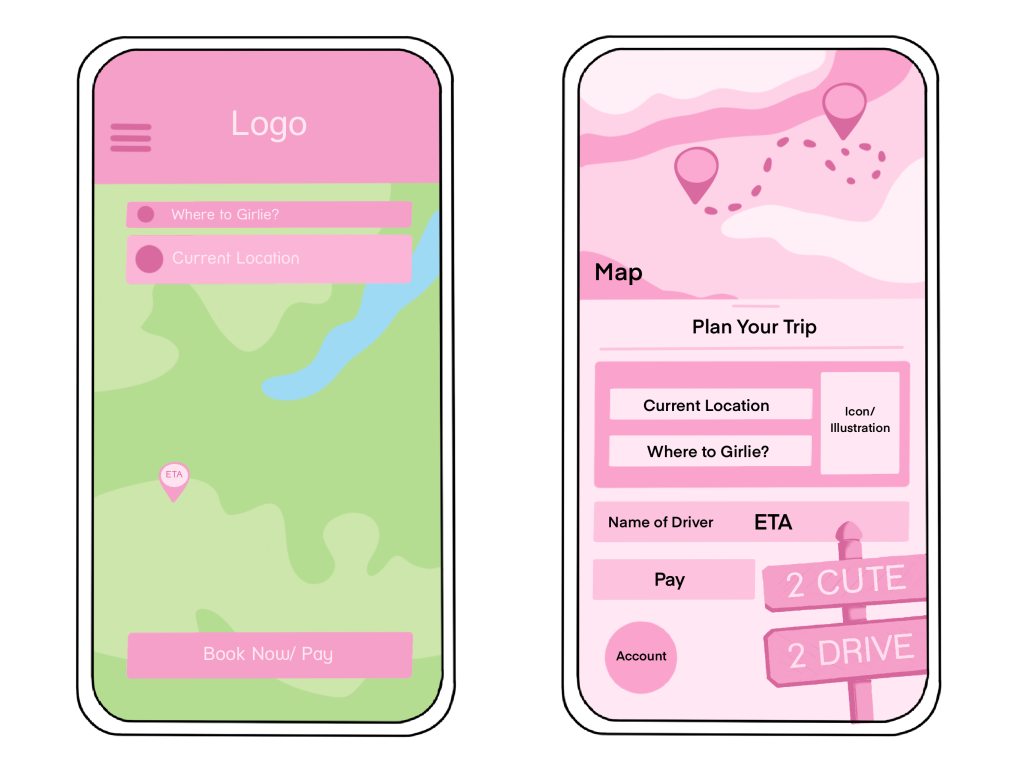
Due to these results, I had a clear structure I knew I wanted to move forward with (design one). From here, it became all about creating the identity of my app, alongside heightening my design laws. By adjusting the position of the logo and tweaking the colour palette to be as legible as possible, I was able to solidify my use of ‘Miller’s Law’ (E. Stevens, 2024). Then, through the addition of relevant icons, my users persona began to shine through. All accumulating to demonstrate a clear call-to-action, which aligned with my companies agenda… to help women feel comfortable in a taxi again.
References
- Emily Stevens (30 April 2024) What are the laws of UX? All 21 laws explained. https://www.uxdesigninstitute.com/blog/laws-of-ux/ [Accessed 15 Dec 2025]
- Figma (2025) Drafts – Figma. https://www.figma.com [Accessed 15 Dec 2025]
- Canva (2025) Home – Canva. https://www.canva.com/ [Accessed 15 Dec 2025]