With our app under development and a clear understanding of our target demographic, it was time to start tailoring our advertisements towards them.
Going into this stage of the project, it was hard for me to grasp how to design things like banners. In the modern era of premium subscriptions and ad-blockers, younger generations are far less likely to engage with advertisements (M. Feeley, 2025). Because of this, I was left relatively stumped on what visuals and messages would translate well into my designs. In order to combat my ignorance, I searched for different sites that used excessive adverts, to see just what stuff I was competing with. The main one I landed on, was a D&D companion site called 5etools (5etools, 2025). This page showcased several different advertising shapes and sizes alongside placement options, giving me a much clearer image of the scaling varieties of my information.
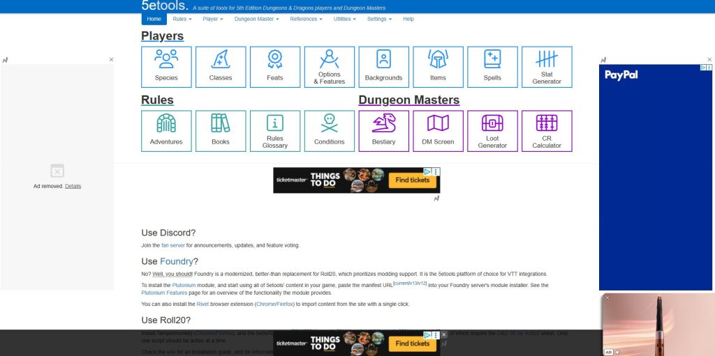
This additional research became vital when designing my Banner, Skyscraper and Rectangle, as it gave me a realistic visual of how large my imagery and call-to-action features needed to be.

One of the first things I felt was crucial to focus on, on all three designs, was logo placement. When it came to the rectangle and skyscraper variants, I realised I had a lot more freedom than my banner. Due to the condensed nature of the Banner design, focusing on key features was vital. This boiled down to three major points, brand, message and call-to-action. Following the designs hierarchy, branding came first, with my logo becoming the literal centre focus of my design. As not to lose the other key pieces of information I decided to have my message and CTA represent opposing sides of my colour palette. By establishing my download button box as a darker shade, I was able to make my text more legible, whilst still in-keeping with my design laws of the ‘Aesthetic Usability Effect’ (E. Stevens, 2024).
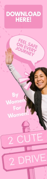
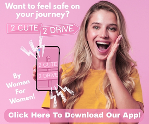
As for my Skyscraper and Rectangle, visuals became the next dominant feature after logo. In order to stay true to my brands identity, I wanted to lean more into the Y2K, early 2000s aesthetic. This meant cheesy, over exaggerated facial expressions, inspired largely by the early Disney Channel commercials of 2002 (YouTube,2019). Combining this with my call-to-action features, made for clear interactive ads. The only thing I felt was missing from these two designs, was message. Given as these were larger pieces of advertisement, I felt this was a great opportunity to add two messages regarding my brand, as opposed to the singular one in my Banner. Whilst also still including my main message of safety, to make sure I incorporated my brands personality, I also chose the addition of “By Women For Women”. By adding this additional piece of information, I was able to firmly establish my brands purpose and identity with my users.
Overall, despite the additional information in some of my designs, I feel each advert shows a clear understanding of how my visual storytelling aids in my brands messaging, without stepping on the toes of some of main design laws, such as ‘Miller’s Law’ (E. Stevens, 2024). By not overcrowding my designs, and staying within my brand guidelines, through the use of colour palette and typography, I’m able to show a clear visual relationship, and consistency in my advertisement campaign.
References
- Canva (2025) Home – Canva. https://www.canva.com/ [Accessed 15 Dec 2025]
- 5etools (2025) 5etools. https://5e.tools/ [Accessed 15 Dec 2025]
- Michael Feeley (2025) Gen Z don’t want to watch your ads. https://newdigitalage.co/advertising/gen-z-dont-want-to-watch-your-ads/#:~:text=Michael%20Feeley,but%20annoying%20wall%20of%20noise%E2%80%9D [Accessed 15 Dec 2025]
- Emily Stevens (30 April 2024) What are the laws of UX? All 21 laws explained. https://www.uxdesigninstitute.com/blog/laws-of-ux/ [Accessed 15 Dec 2025]
- YouTube (2019) Disney Channel Commercials (12/20/2002, incomplete). https://www.youtube.com/watch?v=4sBqISsrmtQ&list=PLxQEBqKtbMQfG0wLynPmLy-Mooww21spo [Accessed 15 Dec 2025]