Approaching this stage in my project, I knew that for my finished logo, I wanted to create a design that threaded the thin line of both my personality and subject matter.
Before starting my design process, my initial step was to brainstorm key interests. Then using the odd word, or phrase, try and transform that into a legible logo concept. This included everything from simple constructs such as cats, books, and wine. All the way to more niche interests such as Dungeon & Dragons and Spirituality.
After compiling a list of legible ideas, I settled on 5 concepts that I wanted to develop further, into ‘finished’ logos. I wanted each logo to use different fonts and colour palettes to try and communicate an eclectic taste.
Of the 5 pieces, I’ve chosen to discuss 2 in more detail, as I feel they contrast not only my style but ability.
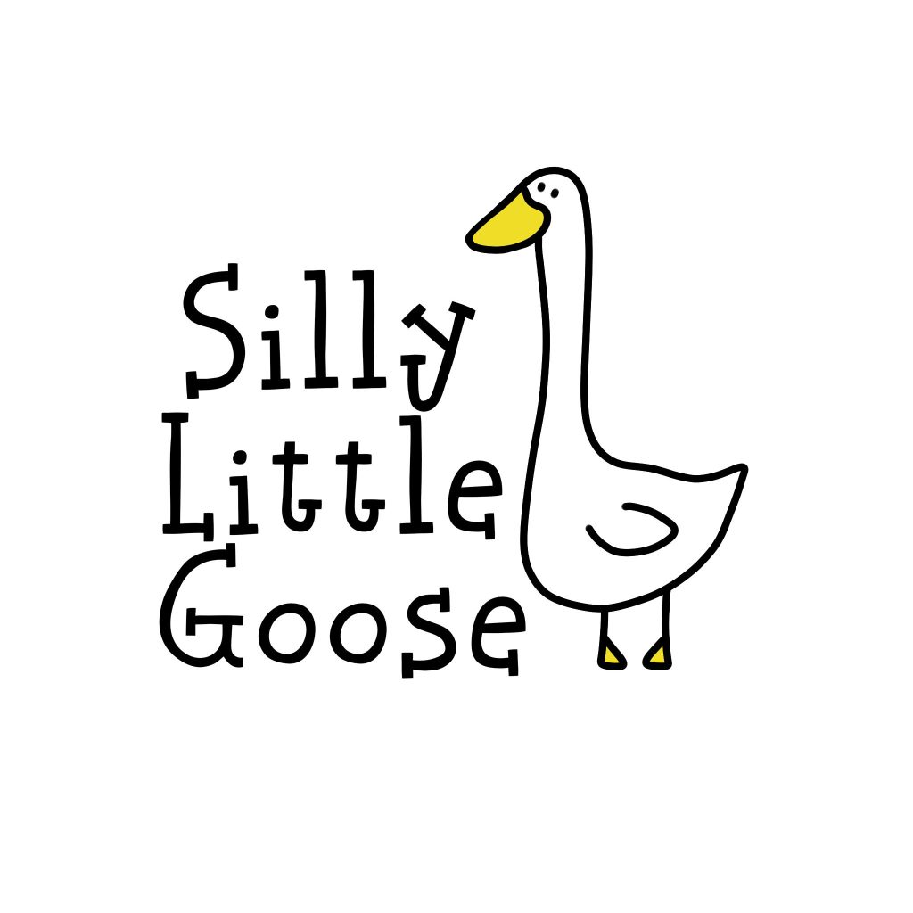
For the first logo, I’ve chosen to pick the ‘Silly Little Goose’ design.
As an initial logo, I’m very fond of this piece. The slogan stems from a deep connection to the gen z kid in me, where all in all I feel I am just a silly little goose. With that in mind, I chose the font for this piece very carefully. I wanted to translate the style of hand-drawn childlike sketch, with sharp wonky lines, complimented with an incredibly simple illustration. I landed on ‘Hand Soup’ by Jakob Fischer1 and with a type size of only 16pt and three stacked baselines, I achieved the style I was looking for.
I paired this whimsical piece of typography, with an equally as quirky illustration. Fitted into the empty space on the right of the text, I added a very ‘silly little goose’ using a thick solid black line, to emulate the font. I chose to add only a touch of yellow to my design, and highly debated going outside the lines for the childlike appearance. Ultimately, I think that the way the design turned out was exactly as I planned. However, after feedback I decided against using it for my finished project. To quote “It’s a lovely logo, yes, but for a theatre company?” I think the logo would be far more suited for a clothing range then a theatre company. Whilst the childlike element is fun, it’s not professional.
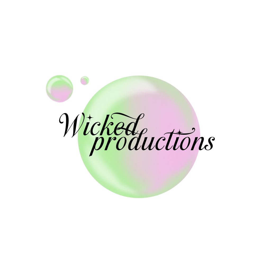
Based off my feedback from my previous piece. For my next logo design, I chose to focus more heavily on the theatre component of my ideas. I landed on ‘Wicked Productions’, inspired heavily by the new release of the film adaptation of Wicked.
Using this concept, I chose to focus on a more magical approach when choosing my typography. I settled on the font ‘Last Christmas’ by Måns Grebäck2, primarily for the sparkle star effect on the i, paired with the exaggerated ascenders.
From here, I chose to add a small illustration into this design. Primarily to help centralize the typography. As an ode to the original ‘Wicked’ I chose to do a pink and green bubble. Demonstrating both of the original characters and the contrasting nature. After receiving peer feedback, I then went in and added two more smaller bubble to help give the piece more movement. Overall, I think this reflects more of my chosen subject, then the previous design.
References
- Jakob Fischer (2025) Hand Soup Font. https://www.dafont.com/hand-soup.font [Accessed 3 Jan 2025] ↩︎
- Måns Grebäck (2025) Last Christmas Font. https://www.dafont.com/last-christmas.font [Accessed 3 Jan 2025] ↩︎