Following my typographical work, I chose to do two-page spread designs for each of my productions. Using my work, I designed rough concepts for each page layout. This helped when gathering feedback, allowing me to tweak ideas before creating the final finished products.
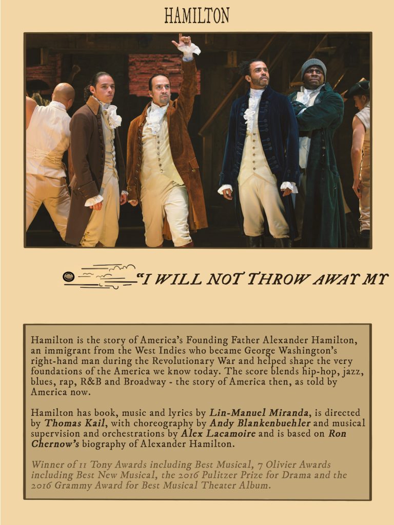
Starting with Hamilton, I followed my plan and design concepts closely. After initial feedback, peer responses agreed that the design needed streamlining. Most felt the text boxes didn’t balance out well in comparison to the images, and for an informational programme, it was lacking in the information. When it came to designing my finished pages, I was more generous with the text boxes. I decided to still keep the images larger, as I felt they still needed to be the focal point, but I agree that the design looks more professional with a larger area for contents.
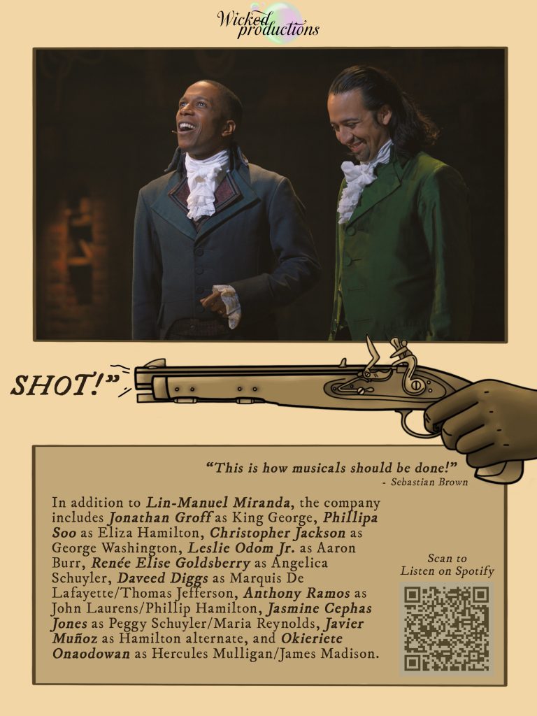
More feedback came from the illustrations. Initially, I had a gun in the centre of my design, with a bullet carried across the pages. After receiving feedback, people said, “The gun looks like it’s floating” “I have no idea what gun that is!” and so on. I set about a redesign… people had issues with a floating gun, it’s now in a hand! I also researched the correct gun for the era. I landed on a flintlock design, and after further feedback, people reminded me that the bullet would have been lead ball, as opposed to a modern design.
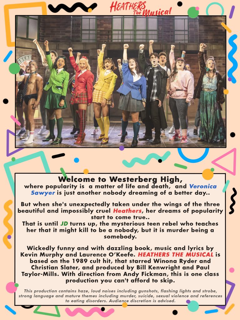
Shifting back to Heathers. This concept received a lot of positive feedback. Once people read through the information, they understood my vision. The notes I received were small, such as “not to make it too busy”, or “maybe add a bit more detail to the graffiti”. So, I did exactly that. After laying the cast images into the design, I went back in and added more detailed illustrations.
In addition to these small changes, the only other thing I changed was the text box. Much like my previous designs, the text to image ratio was very off. I felt that after a full page spread of primarily images, it would be nice to break up a very busy design with a larger area for content. Keeping in mind the comment of “It’s an information programme, it needs information”. This was a design choice not fueled by feedback, but more personal preference.
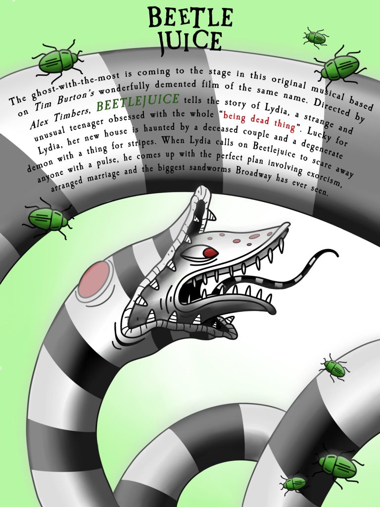
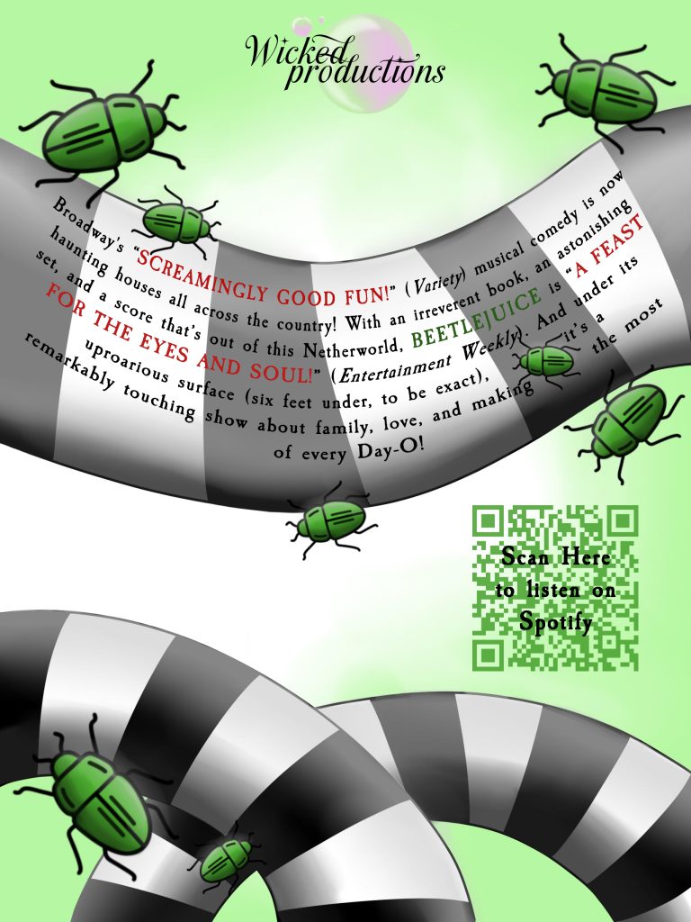
Finally, Beetlejuice. It doesn’t look like I’ve changed much in comparison to my layout. Though after several rounds of feedback, I edited a lot of small components.
Starting with the illustrations. People loved the use of the sandworm to add movement to my pages, feeling it created a distinct theme. However, feedback suggested the beetles “weren’t placed correctly” or “were too big and overcrowding”. I made sure to decrease the amount used, reducing the size, and overlaying some onto the sandworm to make it appear less like they were floating.
The only other element I changed was the placement of the text. People also felt the layout for the first page was far too squished. Having a squashed floating head with text that clashed against the original illustration. I ended up completely removing this component in my final design. I was grateful for this feedback, as I ended up agreeing that it did break up the initial concept too much.
References
- Igino Marini (2025) IM FELL Types Font. https://www.dafont.com/im-fell-types.font [Accessed 3 Jan 2025]
- cove703 (2025) James Stroker Font. https://www.dafont.com/james-stroker.font?fpp=100&psize=l&text=Lipstick [Accessed 3 Jan 2025]
- fontbolt (2025) Beetlejuice Font Generator- Free Download. https://www.fontbolt.com/font/beetlejuice-font/ [Accessed 3 Jan 2025]
- Paul Renner (1927) Futura in Use. https://fontsinuse.com/typefaces/4/futura [Accessed 3 Jan 2025]
- Adobe (2025) Free Online QR Code Generator. https://www.adobe.com/express/feature/image/qr-code-generator?gclid=CjwKCAiA34S7BhAtEiwACZzv4XBO3TfxrPDhw_ogF8wDUjNgV0JBL0cilBvSEM05A1v0TzcyBSlX2xoCfeMQAvD_BwE&mv=search&mv2=paidsearch&sdid=88X75GP8&ef_id=CjwKCAiA34S7BhAtEiwACZzv4XBO3TfxrPDhw_ogF8wDUjNgV0JBL0cilBvSEM05A1v0TzcyBSlX2xoCfeMQAvD_BwE:G:s&s_kwcid=AL!3085!3!718111565734!b!!g!!custom%20qr%20code%20generator!21452545372!170096922451&gad_source=1 [Accessed 3 Jan 2025]
- Disney (2025) Images Disney Plus Press. https://press.disneyplus.com/disney-plus/hamilton/images? [Accessed 3 Jan 2025]
- Pamela Raith (2019) First Look: Production Photos of ‘Heathers the Musical’. https://theatreroyalwindsor.co.uk/heathers-production-photos/ [Accessed 3 Jan 2025]
- Jasmine Aurora (2024) Heathers UK Tour. https://www.jasmineaurora.co.uk/journal/heathers-uk-tour [Accessed 3 Jan 2025]
- Dress Circle (2021) Heathers The Musical at The Other Place Theatre November 2021. https://www.dresscircle.co.uk/shows/heathers-the-musical/the-other-palace-theatre-london [Accessed 3 Jan 2025]
- firstnightmagazine (2025) heather-the-musical-at-sohoplace-cast-image-6. https://firstnightmagazine.com/wp-content/uploads/2024/06/heathers-the-musical-at-sohoplace-cast-image-6.jpg [Accessed 3 Jan 2025]