For my final steps in this project, I chose to create a paper-based prototype paired with a wire-frame rendition of my initial storyboard panels. The goal was to allow people to annotate the sketches and provide honest feedback.
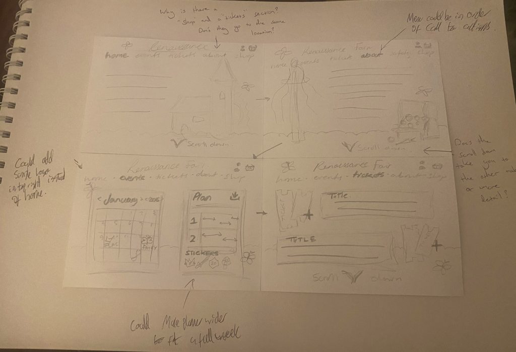

After gathering with my peers, some of the most vital feedback was aimed towards my menu and title sections. One note gave the suggestion of placing the menu bar in order of my call-to-action, an idea I intend to implement. I think creating a better flow to my menu titles, will help guide the users towards my desired outcome (i.e. buying a ticket). Another suggestion was one I had completely failed to consider, the addition of a logo. People found that whilst the title card worked well for the homepage, perhaps a more streamlined variant would work better for my following pages. This amplifies my principles of Jakob’s Law (E. Stevens, 2024), allowing to draw parallels with other websites. I also feel this with de-clutter the app interface and allow the user to navigate the pages without the risk of over-stimulation.
Ultimately, I think using and implementing these critiques will help demonstrate to any potential stakeholders the level of overview. Whilst some feedback asks questions about the addition of a shop alongside tickets, I was still able to explain that the two are completely separate entities and offer the user different experiences. While one is simple procedure resulting in the purchase of a ticket, the other allows the user to browse multiple variations of products as well as outsource them to other sites. All of which I feel demonstrates numerous types of content for my users, alongside a clear call-to-action, that harnesses Fitts’s Law (E. Stevens, 2024).
References
- Emily Stevens (2024) What are the laws of UX? All 21 laws explained. https://www.uxdesigninstitute.com/blog/laws-of-ux/ [Accessed 15 Mar 2025]