Throughout the majority of my assignment, I left out the key design stages for my app. Primarily because I knew that I essentially wanted to emulate the design of my website. This meant that when it came to creating my app, most of my decisions and changes were associated with layout.
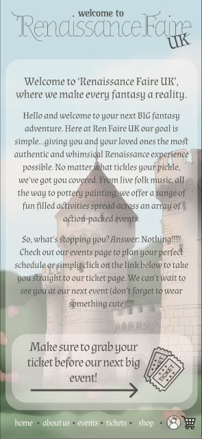
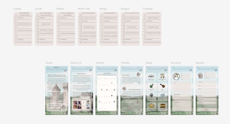
One of the first steps I took when designing the app, was to adjust the alignment of my illustrations. Despite feedback suggesting that I keep the background a more neutral tone, I still chose to incorporate my designs, adjusting their alignment to feature the images more predominantly. I made this decision, as a way to try and in-keep with my design laws, again following the ‘Law of Similarity’ (E. Stevens 2024). However, upon reflection, I have since aligned with my peers and feel that a more muted palette would have perhaps made the app feel less crowded.
Alongside repositioning my backgrounds, I also chose to move my menu bar. This decision was not feedback based, but more inspired by ‘Jakob’s Law’ (E. Stevens 2024). To make the app more user friendly, I adjusted my composition to feature the menu along the bottom of the screen. This will resonate better with my users, as the buttons are now closer to the positioning of the thumb and will encourage them to draw parallels to other apps.
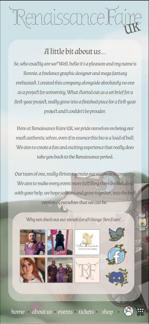
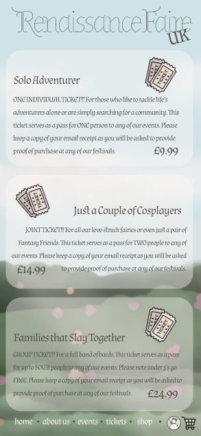
My next two compositional changes heavily impacted my apps usability. Whilst my goal was to emulate my website, I still felt it was vital to not overwhelm my users. Research suggests that reduced word counts will increase the users interaction speed, encouraging them to reach their call-to-action goals quicker (B. Muzyka, 2025). With this mind, I chose to edit my home pages content, significantly reducing the amount of text. I also brought this into effect with the removal of my guidelines page. Despite this being a crucial page for information, feedback from my peers led me to scrap the design. Though I still incorporated it in my website as I felt the information was too important.
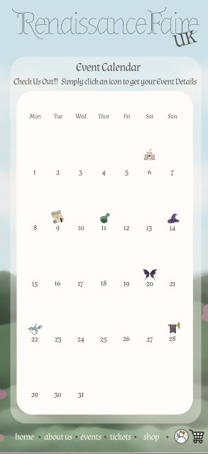
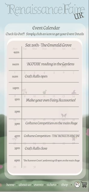
The other key usability changes were through the calendar. Though on first glance it doesn’t appear much has changed, the composition is in fact completely different. Due to the size differences when transferring from a website to an app, most of page features had to be reduced. When reaching my calendar page, peer feedback was very heavily against the incorporation of a split screen overlay like that of my site. People argued that the entire feature became illegible. They were right, which in turn forced my hand to get creative with it. This resulted in me adjusting the positioning on the calendars pop-up overlay. Instead of having the interactive feature appear to the right, it would instead adjust to the centre of the page. This made for a smoother appearance, and also helped instil ‘Fitts’s Law’ (E. Stevens 2024).
References
- Emily Stevens (2024) What are the laws of UX? All 21 laws explained. https://www.uxdesigninstitute.com/blog/laws-of-ux/ [Accessed 14 Apr 2025]
- Bohdana Muzyka (2025) Collection of 11 Mobile App Design Trends 2024 – TechMagic. https://www.techmagic.co/blog/mobile-app-design-trends [Accessed 14 Apr 2025]
App Illustrations and Content
- theminaturespage.com (2025) Historical Information: The Renaissance. http://theminiaturespage.com/ref/history/reninfo.html [Accessed 14 Apr 2025]
- Dreamstime Stock Photos (2025) Middle Ages City Map Kit. Building Set. Medieval Fantasy Sketch. https://uk.pinterest.com/pin/540361655314062696/ [Accessed 14 Apr 2025]
- Whitney (2025) Cottagecore Twitter / X App Icon. https://uk.pinterest.com/pin/540361655314101843/ [Accessed 14 Apr 2025]
- amie taylor-sturdy (2025) Discord Cottagecore app icon. https://uk.pinterest.com/pin/540361655314101819/ [Accessed 14 Apr 2025]
- Aret (2025) Pin on Book Designs. https://uk.pinterest.com/pin/540361655314101812/ [Accessed 14 Apr 2025]
- m (2025) vintage ticket stub. https://uk.pinterest.com/pin/540361655314073160/ [Accessed 14 Apr 2025]
- arriwiste (2025) market. https://uk.pinterest.com/pin/540361655314016134/ [Accessed 14 Apr 2025]
- LudaDesignHub (2025) Old English Medieval Castle Clipart for Commercial Use-Majestic Historical Images for Craft, Decor, and Scrapbooking-12 High-Resolution PNGs. https://www.etsy.com/uk/listing/1768444701/old-english-medieval-castle-clipart-for?epik=dj0yJnU9VF9wZnNPbzlIUGFDR0FDNVd1NlBqZ2owRzR3M2R6bzUmcD0wJm49d2dXRkFtSGN5V25xRDZick1HUFlmZyZ0PUFBQUFBR2Y5Njd3 [Accessed 14 Apr 2025]
- Clipartqueen (2025) Medieval Clipart. https://uk.pinterest.com/pin/540361655314045642/ [Accessed 14 Apr 2025]