Thanks to my initial idea stage, I had a clear drawn-out plan of the direction I wanted to take this project.
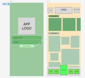
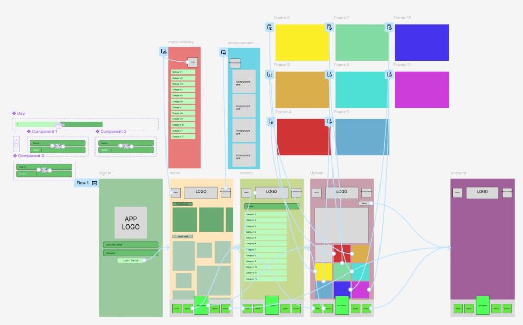
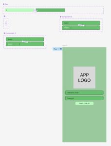
My first step in creating my wire-frame, was to build the reoccurring main features of my app. This meant, creating the title header bar and the footer navigation bar, alongside designing and adding my overlay for the menu and announcement sections. As I previously discussed in my last blog, this layout choice was encouraged by Jakob’s Law (E. Stevens 2024).
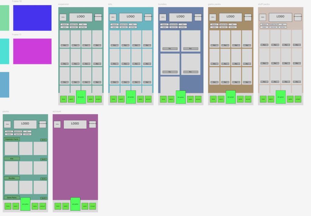
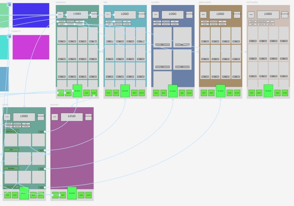
From here, I then started adding template boxes to each page, aligning and adjusting them to fit my initial layout design. It was also at this point that I began colour coding each page. This was essential during my design stage, especially when creating the ‘Pack’ pages as their similar layouts began to blend with one another without key features to help separate them.
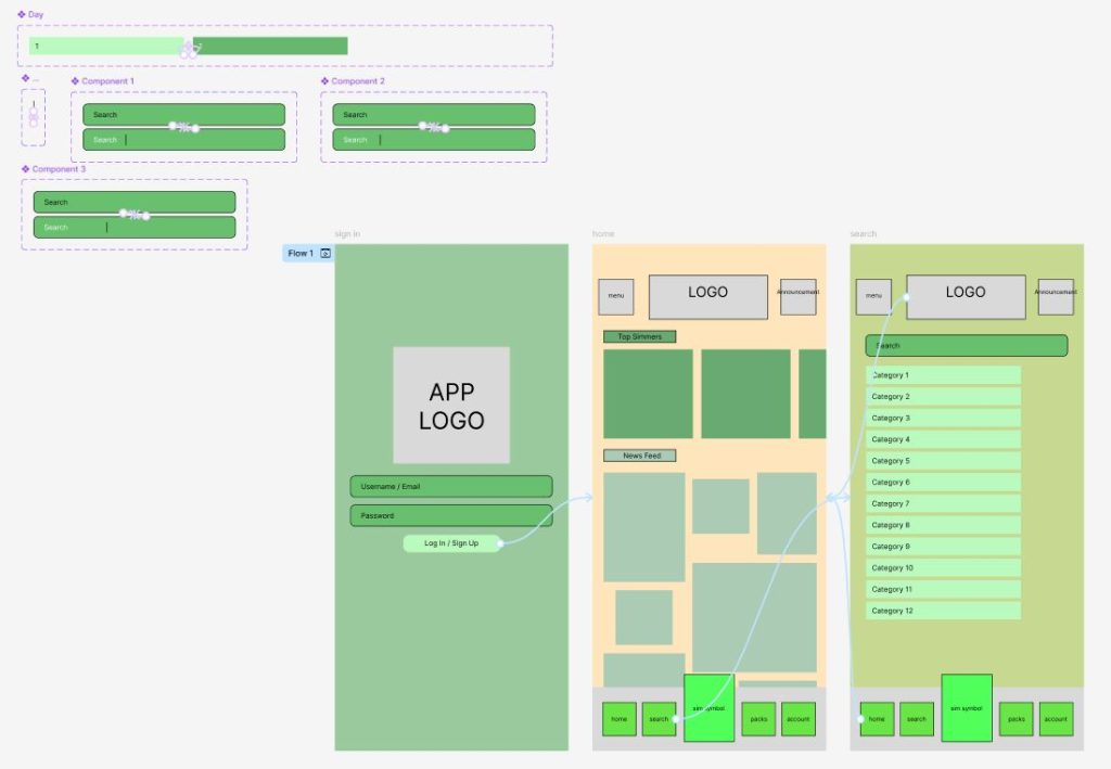
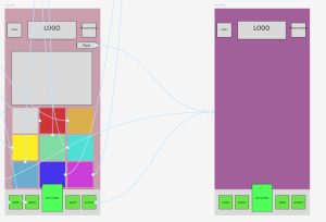
When moving into my upload frame, I chose to add an extra overlay feature that allowed my user to view their chosen images on a larger scale. This feature is hard to see in the screenshots of my design but should translate slightly clearer in the run through. This page was inspired by the upload feature in the ‘Instagram’ app (Instagram, 2025), again as an attempt to instil Jakob’s Law (E. Stevens 2024), but also as a way to connect with my desired key demographic. Ultimately trying to draw a parallel to other key generational apps.
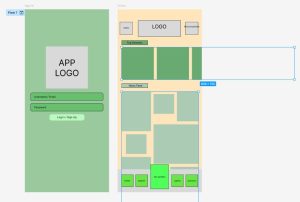
Finishing off my wire frame, I chose to incorporate the scrolling features before moving into the construction of my final design. I did this by fixing key elements of the pages into place, whilst individually coding other features to move either horizontally or vertically, depending upon my design. Overall, I wanted this wire-frame to work exactly like my final design, making it easier for me to simply overlay my finished drawings in my final stage.
References
- Instagram (2025) Instagram. https://www.instagram.com/ [Accessed 5 May 2025]
- Emily Stevens (2024) What are the laws of UX? All 21 laws explained. https://www.uxdesigninstitute.com/blog/laws-of-ux/ [Accessed 5 May 2025]